Graphics Programs Reference
In-Depth Information
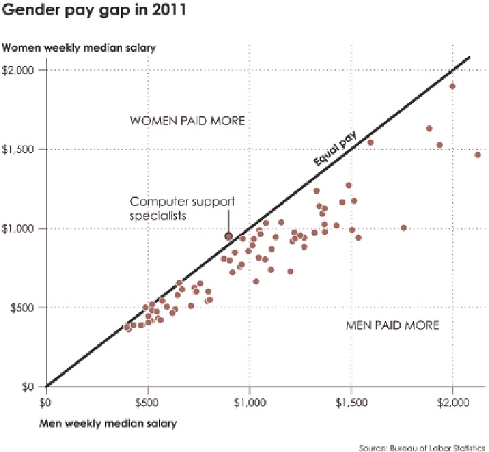
Statistics. Each dot represents a profession, and men's median salary is plotted
on the horizontal axis versus women's median salary on the vertical.
Without annotation, it's clear there is an expected upward trend between the
two. With professions where men tend to make more, women tend to make
more, too. If you look closely, you can also see that the dots tend toward
the horizontal axis, which means men tend to make more with the same
occupation.
The annotated chart in Figure 5-35 makes the pay difference clearer. A diagonal
line through the middle represents equal pay, which is marked as such. Dots
below the line are jobs where men make more than women, and dots above
the line are where women tend to make more. These areas are also labeled.
FIGURE 5-35
Annotated
scatter plot
Search WWH ::

Custom Search