Graphics Programs Reference
In-Depth Information
you don't pay attention to the context of
the data, you might show patterns that
look obvious but are not significant.
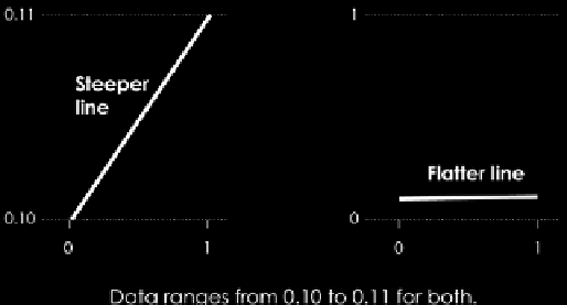
Figure 5-12 is the Cartesian equivalent.
The space between each tick mark on the
vertical scale is tiny, but because the span
of the values is also small, the change in
the line's position looks big.
Sometimes it makes sense to do this, and
other times the zoom exaggerates what's
actually there. A rule of thumb: Match the
amount of visual change to the significance of the change in real life, and as
always, represent the data fairly so that others can make fair comparisons.
F I G U R E 5-12
Zoomed in on a
Cartesian coordinate system
REPRESENT CONTEXT
Context helps readers relate to and understand the data in a visualization
better. It provides a sense of scale and strengthens the connection between
abstract geometry and colors to the real world. You can introduce context
through words that surround a chart, such as in a report or story, but you can
also incorporate context into the visualizations through your choice of visual
cue and design elements.
As shown in Figure 5-13, Stephen Von Worley showed the increased variety
of colors in the Crayola crayon spectrum. In 1903, on the release of the first
wax crayons under the brand name Crayola, there were just 8 colors. Over
the years, Crayola inherited and created other colors in between the existing
hues, and by 2010, there were 120 shades offered. In addition to red, there is
now also bittersweet, brick red, mahogany, maroon, orange red, red orange,
violet red, wild watermelon, radical red, razzmatazz, fuzzy wuzzy, and scarlet.
It makes sense to use the actual colors to represent the shades each year, to
show the increase in diversity. A grayscale version would require a label for
each shade and would quickly clutter by 1949.
Note:
Choose geometry and color based on
the context of your data. Software defaults are
rarely, if not never, the best option.
Often your choice of visual cues changes based on the
expectations of those you make a graphic for. A graphic
that does not fulfill expectations can confuse readers. (I of
course, mean this from a design perspective rather than
a data one. Unexpected trends, patterns, and outliers are
always welcome.)
Search WWH ::

Custom Search