Graphics Programs Reference
In-Depth Information
point of interest. This creates a visual hierarchy that helps readers immediately
focus on the vital parts of a data graphic and use the surroundings as context,
as opposed to a flat graphic that a reader must visually rummage through.
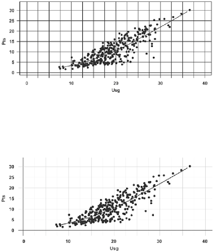
For example, Figure 5-1 is the scatterplot from the previous chapter that shows
NBA players' usage percentage versus points per game. The dots, fitted line,
grid, border, and labels are of the same color and thickness, so there is no clear
visual focus. It's a flat image, where all the elements are on the same level.
FIGUR E 5-1
All visual elements
on the same level
This is easily remedied with a few small changes. In Figure 5-2, the line width
of the grid lines is reduced so that they are no longer as thick as the fitted line.
In this example, you want the data to stand out. The grid lines also alternate
in width so that it is easier to see where each data point lies in the coordinate
system, and there's no imaginary blur that you get in the original chart.
FIGURE 5-2
Width of grid lines
reduced to fit in background
Search WWH ::

Custom Search