Graphics Programs Reference
In-Depth Information
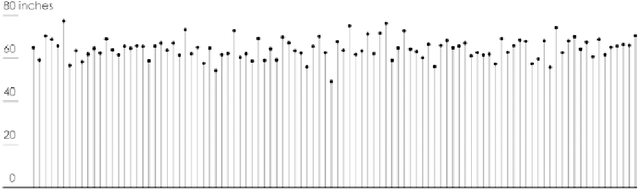
Now look at a classic example. Imagine there are 100 adults in a room. These
100 people have different heights, as shown in Figure 4-51. They range from
4 feet and 10-inches tall to 62-feet tall, and the average height for the group
is 5 feet and 4 inches.
FIGURE 4-50
(facing page) Using
multiple visualization methods to
explore different dimensions
It's hard to determine how many people there are in various height ranges
without counting each dot, but you can get a better idea if you sort everyone
from shortest to tallest, as shown in Figure 4-52. There are a few relatively tall
people and a few short people, but most heights are around the 5 to 6-foot
range. The median line at 64 inches is in the middle, where 50 people are
shorter and 50 people are taller.
You get a better sense of the heights in the room, but there's a better way to
see the distribution. You can group them into height categories or bins, such
as those in between 4 feet and 42- feet, as shown in Figure 4-54.
Now it is easy to see where most people are centered and to see the spread
across a range. However, the dot plot can take a lot of space, especially if you
had a lot more heights to show. So instead of dots, you could use bars, as
shown in Figure 4-54. This chart is called a
histogram
, which you'll see more
of soon. This counting and binning process is the basis for visualizations used
to explore distributions.
As shown in Figure 4-55, you can visualize distributions with varying levels
of granularity. Some views show only summary statistics, such as median,
whereas other views, such as the histogram, show distribution in greater
detail.
FIGURE 4-51
Heights of 100 imaginary people
Search WWH ::

Custom Search