Graphics Programs Reference
In-Depth Information
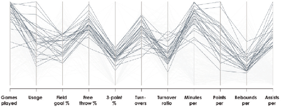
Whereas the heat map and parallel coordinates plot provide an overview of the
data, you might also want to look at individual data points more closely. Star
plots, as you saw with time series data and shown again in Figure 4-47, pres-
ent data separately. That is, you represent each row of data with its own plot.
The time series example uses the angle portion of the polar coordinate system
for time. This example uses multiple variables. So in the same way that the
star plot can be a polar coordinate version of a time series chart, it can also
be a polar coordinate version of a parallel coordinates plot.
FIGURE 4-46
Highlight data for easier reading
USING MULTIPLE VIEWS
Note:
As you gain more experience visualiz-
ing data, you'll notice that you can use many
of the same type of charts for different types
of data.
There's an inclination to show all the data at once, in a single
view. When you have categorical data, you make a bar chart,
and when you have time series data, you use a line chart. So if
you have multiple variables that might be categorical, temporal,
and spatial, you might also want to put it all in a single chart.
However, it can and often is better to use multiple charts instead because it
lets you see the data from more angles.
You can, for example, make a lot of the same type of chart on multiple dimen-
sions, such as the maps in Figure 4-30. The flight data is actually spatial, cat-
egorical, and temporal, so you get natural breaks in the data and a hint of
places to look. Figure 4-48 explores the time series component of the flight
data. Each line represents flight volume for an airline.
Search WWH ::

Custom Search