Graphics Programs Reference
In-Depth Information
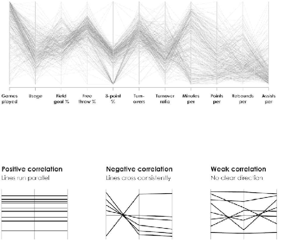
FIGURE 4-44
Parallel coordinates plot
If all the variables had strong positive correlations (which almost never hap-
pens), all lines would run straight across. If two variables were negatively
correlated, you'd see lines on the top of one variable connect to the bottom
of the axis for the other variable. Figure 4-45 shows a few more relationships.
FIGURE 4-45
Relationships with parallel coordinates plot
When there aren't clear relationships across the board, it can be hard to see
patterns. There's high variability from player to player in Figure 4-45, so you
end up with a jumble of lines. You can however, highlight data based on
criteria for a better view.
For example, if you highlight players who averaged five assists or more and
gray out everyone else, as shown in Figure 4-46, it's easier to see how these
type of players perform in other categories. Assist leaders play in more games,
play more minutes, and tend to rebound less, but still vary in terms of points
and field goal percentage.
Search WWH ::

Custom Search