Graphics Programs Reference
In-Depth Information
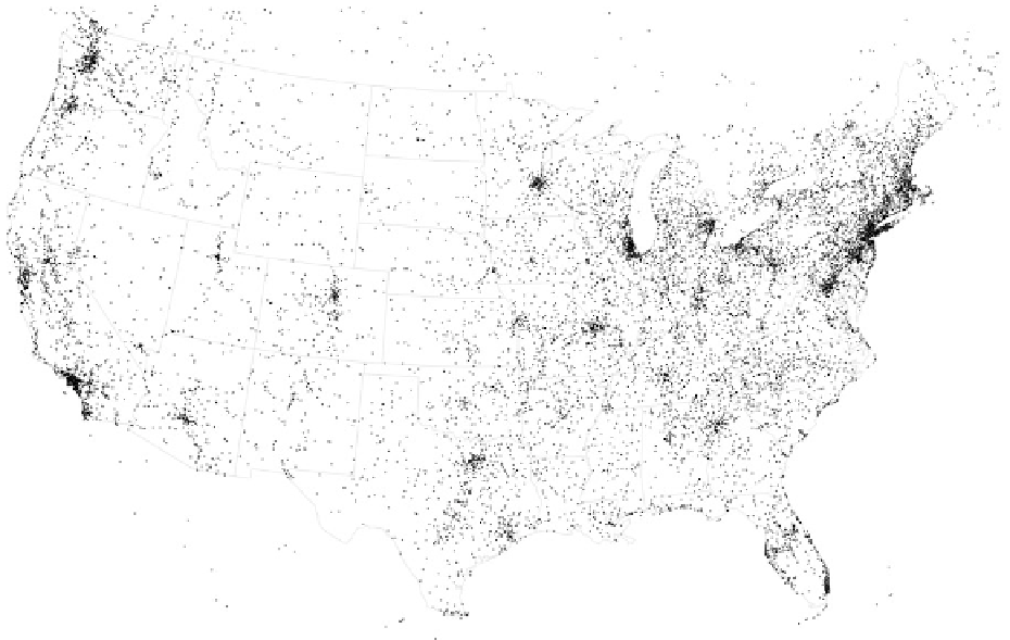
There are also times when your spatial data actually does contain specific
locations, but you're more interested in the aggregates. You might have a
dataset with a lot of locations, and there are a lot of points in metropolitan
areas. So when you map everything, points overlap, and it's difficult to tell
how many observations there are in the dense areas.
For example, Figure 4-33 shows all recorded UFO sightings between 1906 to
2007, according to the National UFO Reporting Center. In areas where there
were a lot of sightings (which curiously are where a lot of major airports are
located), you just see a black blob, and it's hard to tell how many sightings
there were when there is too much overlap.
Figure 4-34 shows the same data, but as a filled contour map. A color scale
is used to show sightings density, where white means more sightings and
black means none, and varying shades of red are for everything in between.
FIGURE 4-33
Overlapping points on a map
Search WWH ::

Custom Search