Graphics Programs Reference
In-Depth Information
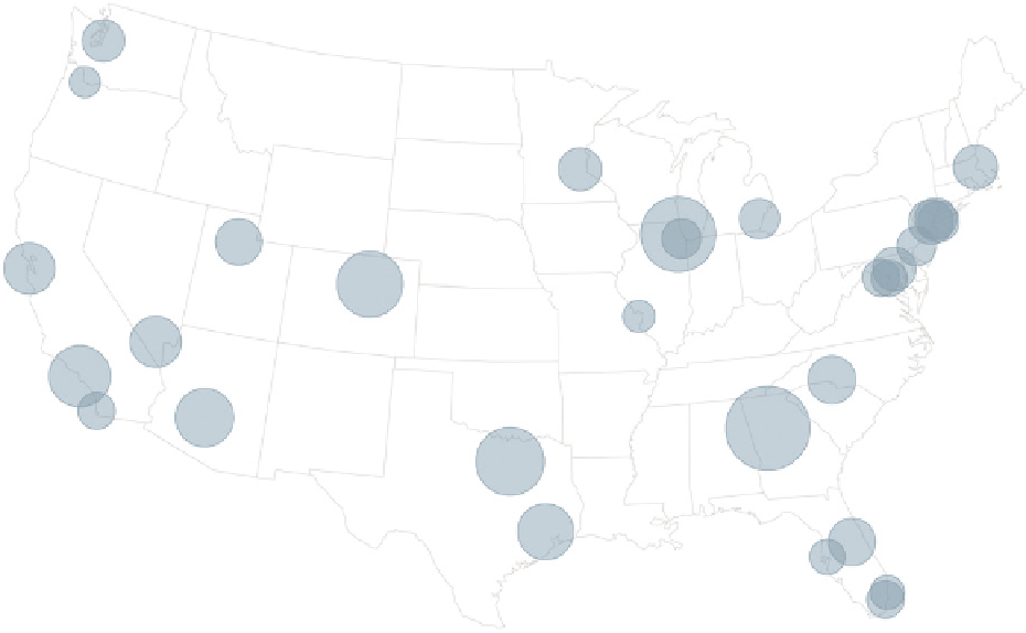
FIGURE 4-28
Bubbles to show an additional metric on a map
more flights that went to and from those two airports. Busier airports also
appear where there is a higher density of flights.
It's fun to see patterns emerge when you plot a lot of data at once. The map
represents more than 6 million domestic flights in 2011, and you gain a rough
idea of where people flew to and from. But there's more you can take away
from this data by splitting it into categories. For example, map flights by
airline, as shown in Figure 4-30, and you see the data with a new dimension.
Note:
When you have a lot of data, it is often
to your benefit to split it into groups so that
you can see details more clearly.
Hawaiian Airlines flies only from the west coast to the islands;
Atlantic Southeast Airlines is true to its name; Southwest
stays within the contiguous United States; and Delta flies
to a number of places, but you can see their major hubs in
Atlanta, New York, Detroit, and Salt Lake City.
Search WWH ::

Custom Search