Graphics Programs Reference
In-Depth Information
There's clearly a regular day-to-day pattern. The thin
lines that overlap give the appearance of thicker
bands.
There are also some obvious outliers. Thursdays
and Fridays are much lower than the rest of the
year, and four Sundays also appear lower. Take a
moment to think about why travel might be lower
than usual on those days.
The obvious way to figure out the dates of the
outliers is to go back to the data and look at the
minimums for each day. That's always there for your
reference. You can also refer to the linear view in
Figure 4-17 for a rough idea, but is there a way to
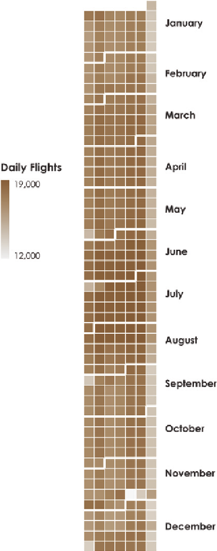
directly get the dates and see the data? Figure 4-25
shows the data in a familiar calendar format. The
first column is Sunday, the second is Monday, and
so on, to Saturday at the end.
The advantage of the calendar heat map over the
line chart is that, along with seeing cycles as you
scan top to bottom, it's easy to see specific days in
rows and columns, so it's easier to reference what
day of the year each value is for. The first three
low-volume Sundays precede holidays that fall on
a Monday in the United States: Memorial Day on
May 30, Independence Day on July 4, and Labor Day
on September 5. The last Sunday was Christmas. As
for the low-volume Thursday and Friday, that was
Thanksgiving weekend in November.
A disadvantage of the calendar is that color is the
visual cue, and it can be hard to see small differ-
ences. It's easier to compare positions on the line
chart. So there are trade-offs between different
views, but then again, there's no harm in looking
at your data from all angles.
Note:
The calendar heat map is an intuitive layout that you
see often in your everyday life, but is underused as an explor-
atory tool. It can come in handy.
FIGURE 4-25
Calendar heat map
Search WWH ::

Custom Search