Graphics Programs Reference
In-Depth Information
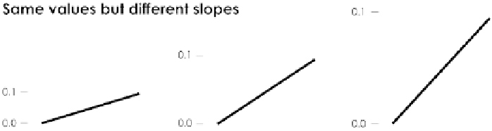
FIGURE 3-8
Same amount of
change shown on varied scales
Shapes
Shapes and symbols are commonly used with maps to differentiate categories
and objects. Location on a map can be directly translated to the real world,
so it makes sense to use icons to represent things in the real world. You might
represent forests with trees or residential areas with houses.
In a chart context, shapes to show variation are used less frequently than they
used to be. When graphs were drawn with paper and a pencil and computers
still worked with punch cards, symbols were an easy way to differentiate cat-
egories. For example, as shown in Figure 3-9, triangles and squares could be
used in a scatterplot, which is quicker to draw than to switch between colored
pencils and pens or fill a single shape with a solid or cross-hatched pattern.
Nevertheless, varied shapes can provide context that points alone can't, and
it's typically not more difficult to try with your favorite software.
Area and Volume
Bigger objects represent greater values. Like length, area and volume can be
used to represent data with size, but with two and three dimensions, respec-
tively. For the former, circles and rectangles are commonly used, and with the
latter, cubes and sometimes spheres. You can also size more detailed icons
and illustrations.
Be sure to mind how many dimensions you use. The most common mistake
is to size a two- or three-dimensional object by only one dimension, such
as height, but to maintain the proportions of all dimensions. This results in
shapes that are too big and too small, which makes it impossible to fairly
compare values.
Search WWH ::

Custom Search