Graphics Programs Reference
In-Depth Information
When you visualize data, you represent it with a combination of visual cues
that are scaled, colored, and positioned according to values. Dark-colored
shapes mean something different from light-colored shapes, or dots in the
top right of a two-dimensional space mean something different than dots in
the bottom left.
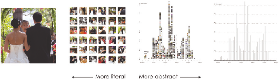
Visualization is what happens when you make the jump from raw data to
bar graphs, line charts, and dot plots. It's the process that takes you from the
grid of photos in Chapter 1, “Understanding Data,” to a bar graph over time,
as shown in Figure 3-1.
FIGUR E 3-1
Abstraction process
It's easy to think that this process is instant because software enables you to
plug data in, and you get something back instantly, but there are steps and
choices in between. What shape should you choose to encode your data? What
color is most appropriate for the purpose and message? You can let the com-
puter choose everything for you (it can save time), but there are advantages
when you choose. At the least, if you know the elements of visualization and
how they can be combined and modified, you know what to tell the computer
to do rather than let the computer dictate everything you make.
In many ways, visualization is like cooking. You are the chef, and datasets,
geometry, and color are your ingredients. A skilled chef, who knows the pro-
cess of how to prepare and combine ingredients and plate the cooked food,
is likely to prepare a delicious meal. A less skilled cook, who heads to the local
freezer section to see what microwave dinners look good, might nuke a less
savory meal. Of course, some microwave dinners taste good, but there are a
lot that taste bad.
Search WWH ::

Custom Search