Graphics Programs Reference
In-Depth Information
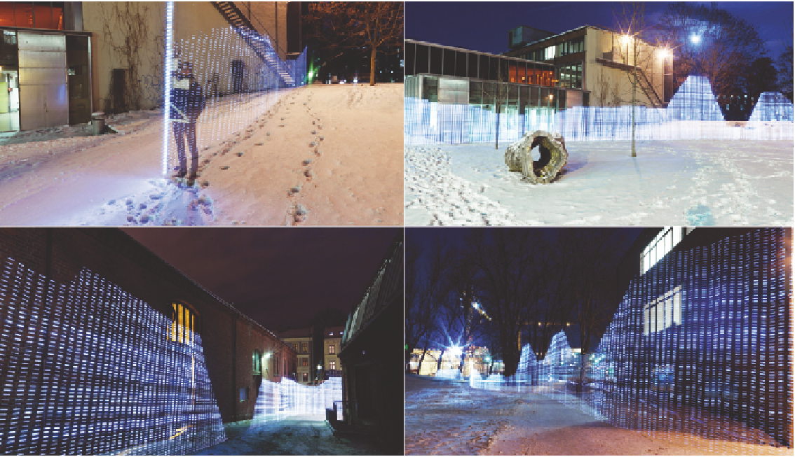
FIGURE 2-28
Immaterials: Light painting WiFi
(2011) by Timo Arnall, Jørn Knutsen and Einar Sneve Martinussen,
https://vimeo.com/20412632;
Photo by Timo Arnall
Real data sources are used and they are mapped geographically, but by com-
bining all the sources and using less traditional aesthetics, the appearance of
the geography seems to change.
In
Wind Map
, another work by Fernanda Viégas and Martin Wattenberg, who
use visualization as both a tool and expression, wind patterns flow across the
United States, as shown in Figure 2-30. The forecasts are updated once per
hour from the National Digital Forecast Database, which you can explore by
zooming and panning. You can also mouse over flows for wind speed and
direction. The more concentrated and faster the streams on the map, the
greater the forecasted speed.
Search WWH ::

Custom Search