Graphics Programs Reference
In-Depth Information
Note:
Although Wikipedia is an encyclopedia,
because it's always changing, you can also
easily relate activity to current events, such as
times of unrest or shifts in political power.
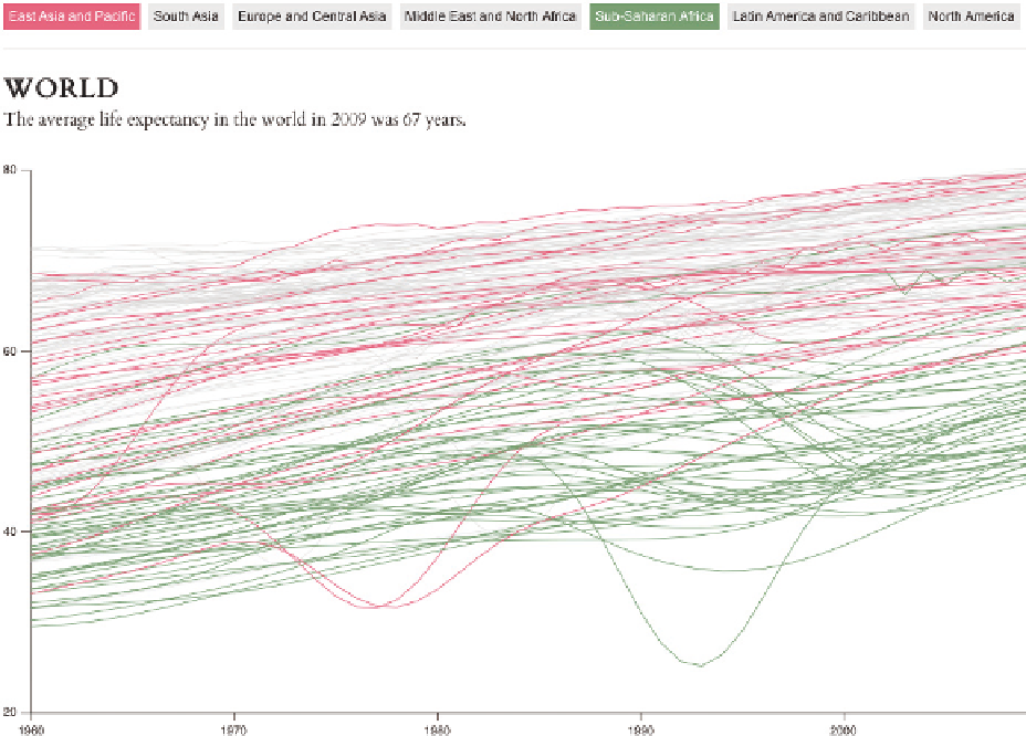
The World Bank provides countrywide data in an easy-to-
download format to help you gain an understanding on the
progress of the world. Figure 2-4 (an interactive I made to
look at life expectancy over the years for different countries)
shows an overall increase for most regions; but at the same
time, big dips indicate wars and times of struggle in some places. You can, for
example, see the Bangladesh Liberation War in the 1970s, the Iran-Iraq War in
the 1980s, and the Rwanda Civil War in the 1990s. There's a smaller dip for Iraq
in early 2000. Selectable regions and countries enable you to highlight specifics.
From a methodology point of view, both
History Flow
and the life expectancy
charts are a modified stacked area chart and multiple time series, respectively.
The data makes them interesting, but pre-Internet, these numbers would have
been harder to come by, if they existed at all.
FIGURE 2-4
Life expectancy around the world,
http://datal.ws/24w
Search WWH ::

Custom Search