Graphics Programs Reference
In-Depth Information
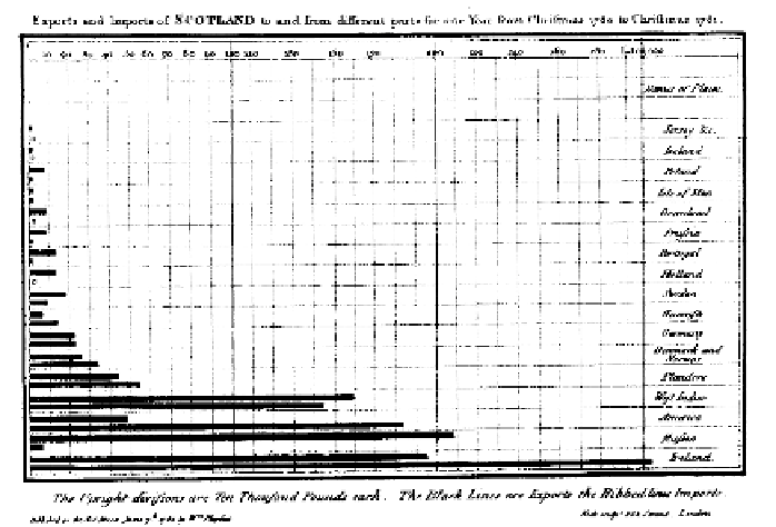
FIGUR E 2-1
Bar chart from
The
Commercial and Political Atlas
by
William Playfair
The fun starts when you look at the event history for articles, which is freely
available via the site. Fernanda Viégas and Martin Wattenberg explored this
concept in 2003 with
History Flow
, a tool that enables you to explore the his-
tory of any Wikipedia entry over time.
As shown in Figure 2-3, the visualization looks like an inverted stacked area
chart, where each layer represents a body of text. As time passes, new layers
(encoded with different colors) are added (or removed), and you can see the
change in overall size via the total vertical height of the full stack.
Notice the zigzag pattern and the seemingly random sections of black? The
former shows debate between users, and the latter is when someone deleted
a portion of the article, either because of a disagreement or a user is just in
it for the lulz.
The most interesting aspect of
History Flow
is the changes over time for each
article. When events occur in real life, it's hard to see the big picture because
you're so focused on a single event. As a Wikipedia user in a heated debate,
your main concern is what the opposition just did and then you figure out
how to react, but when you take a step back to see the overall changes after
the fact, it's likely you'll see something interesting.
FIGURE 2-2
William Playfair
created the pie chart for
Statistical
Breviary
in 1801

Search WWH ::

Custom Search