Graphics Programs Reference
In-Depth Information
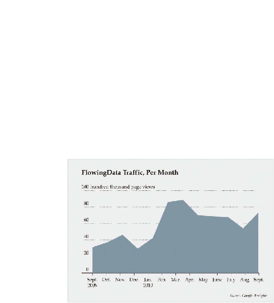
When you look at it on a monthly basis, as shown in Figure 1-7, fewer data
points are on the same graph, covering the same time span, so it looks
much smoother.
I'm not saying one graph is better than the other. In fact, they can comple-
ment each other. How you split your data depends on how much detail you
need (or don't need).
Of course, patterns over time are not the only ones to look for. You can also
find patterns in aggregates that can help you compare groups, people, and
things. What do you tend to eat or drink each week? What does the Presi-
dent usually talk about during the State of the Union address? What states
usually vote Republican? Looking at patterns over geographic regions would
be useful in this case. While the questions and data types are different, your
approach is similar, as you'll see in the following chapters.
FIGurE 1-7
Monthly unique visitors to FlowingData

Search WWH ::

Custom Search