Graphics Programs Reference
In-Depth Information
The base of the graphic is simply a line chart. However, design elements
help tell the story better. Labeling and pointers provide context and help
you see why the data is interesting; and line width and color direct your
eyes to what's important.
Check out some
of the best
New
York Times
graphics
at
http://datafl
.ws/nytimes
.
Chart and graph design isn't just about making statistical visualization but
also explaining what the visualization shows.
Art
See Geoff
McGhee's video
documentary
“Journalism in the
Age of Data” for
more on how
journalists use
data to report
current events.
This includes great
interviews with
some of the best
in the business.
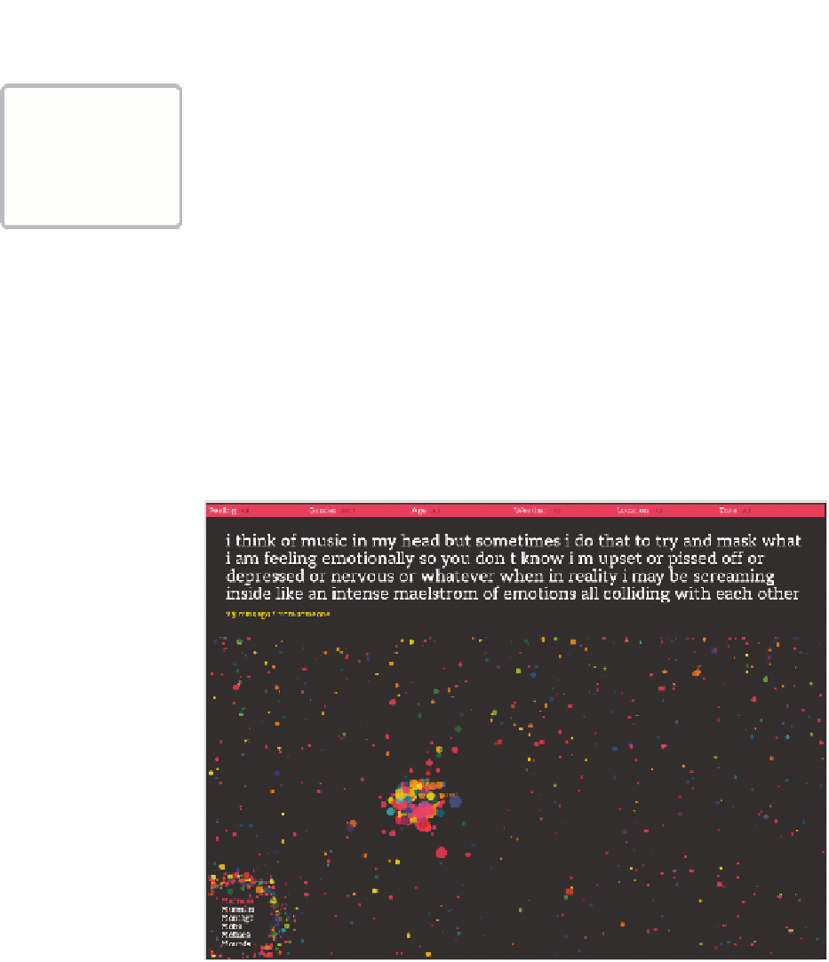
The New York Times
is objective. It presents the data and gives you the
facts. It does a great job at that. On the opposite side of the spectrum,
visualization is less about analytics and more about tapping into your emo-
tions. Jonathan Harris and Sep Kamvar did this quite literally in
We Feel
Fine
(Figure 1-2).
FIGurE 1-2
We Feel Fine by Jonathan Harris and Sep Kamvar


Search WWH ::

Custom Search