Graphics Programs Reference
In-Depth Information
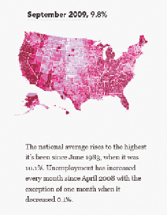
Fast forward to 2009, and there is a clear difference, as shown in Fig-
ure 8-28. The national average increased 4 percentage points and the
county colors become very dark.
FIGurE 8-27
Unemployment rates
in 2008
FIGurE 8-28
Unemployment rates during
September 2009
This was one of the most popular graphics I posted on FlowingData
because it's easy to see that dramatic change after several years of rela-
tive standstill. I also used the OpenZoom Viewer, which enables you to
zoom in on high-resolution images, so you can focus on your own area to
see how it changed.
P
When high-res-
olution images are
too big to display
on a single moni-
tor, it can be useful
to put the image
in OpenZoom
Viewer (
http://
openzoom.org
)
so that you can
see the picture
and then zoom in
on the details.
I could have also visualized the data as a time series plot, where each line
represented a county; however, there are more than 3,000 U.S. counties.
The plot would have felt cluttered, and unless it was interactive, you would
not be able to tell which line represented which county.
Take the Difference
You don't always need to create multiple maps to show changes. Some-
times it makes more sense to visualize actual differences in a single map.
It saves space, and it highlights changes instead of single slices in time, as
shown in Figure 8-29.


Search WWH ::

Custom Search