Graphics Programs Reference
In-Depth Information
data as the news, and with that came a lot of design, organization, fact
checking, sleuthing, and research.
There was one day when my only goal was to verify three numbers in
a dataset, because when
The New York Times
graphics desk creates a
graphic, it makes sure what it reports is accurate. Only after we knew the
data was reliable did we move on to the presentation. It's this attention to
detail that makes its graphics so good.
Take a look at any
New York Times
graphic. It presents the data clearly,
concisely, and ever so nicely. What does that mean though? When you look
at a graphic, you get the chance to understand the data. Important points
or areas are annotated; symbols and colors are carefully explained in a
legend or with points; and the
Times
makes it easy for readers to see the
story in the data. It's not just a graph. It's a graphic.
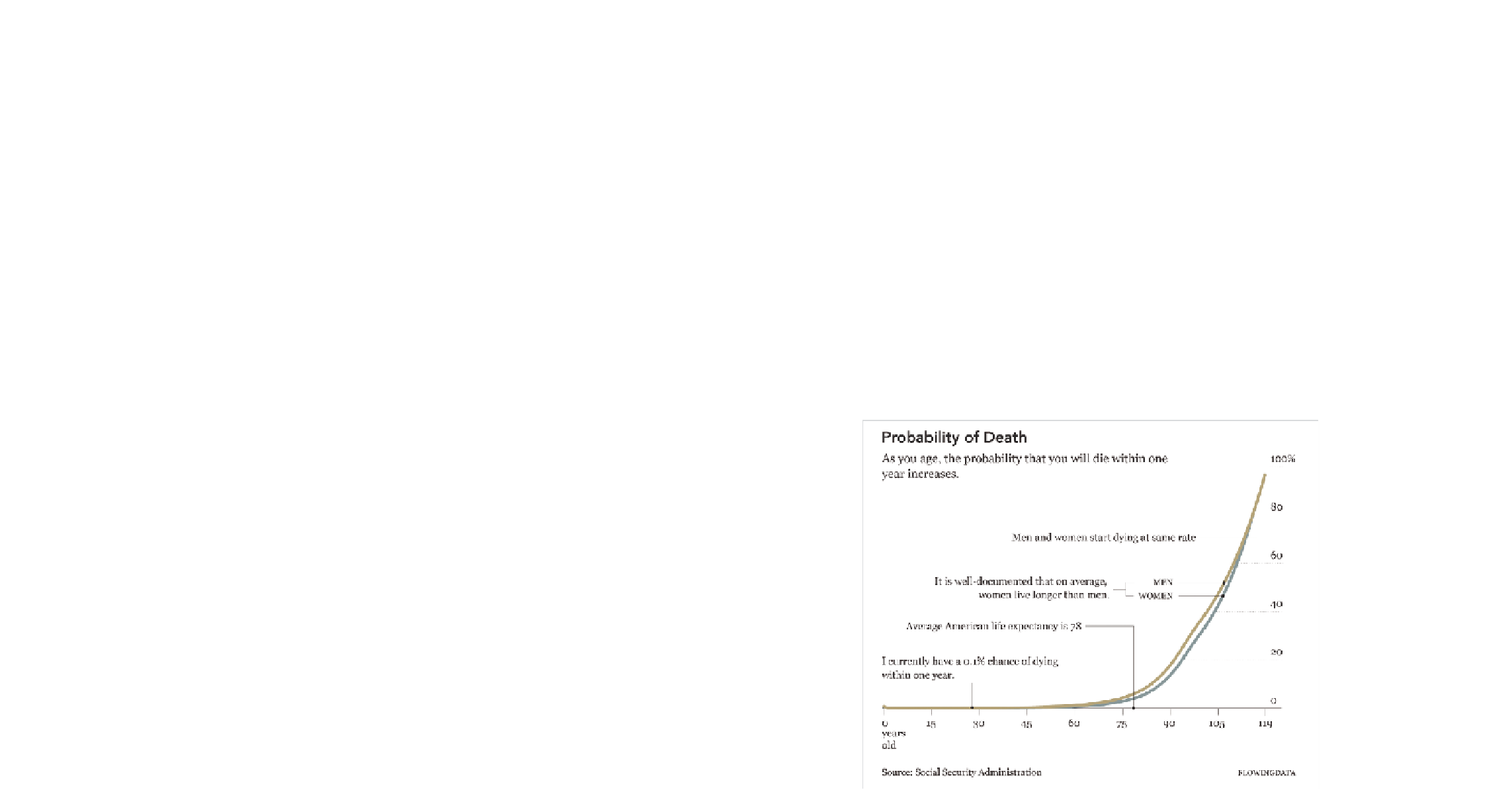
The graphic in Figure 1-1 is similar to what you will find in
The New York
Times
. It shows the increasing probability that you will die within one year
given your age.
FIGurE 1-1
Probability of death given your age


Search WWH ::

Custom Search