Graphics Programs Reference
In-Depth Information
Instead of hard-coding the values 6.9, 8.7, and 10.8 in your code, you can
replace those values with
q1
,
q2
, and
q3
, respectively. The advantage of cal-
culating the values programmatically is that you can reuse the code with a
different dataset just by changing the CSV file.
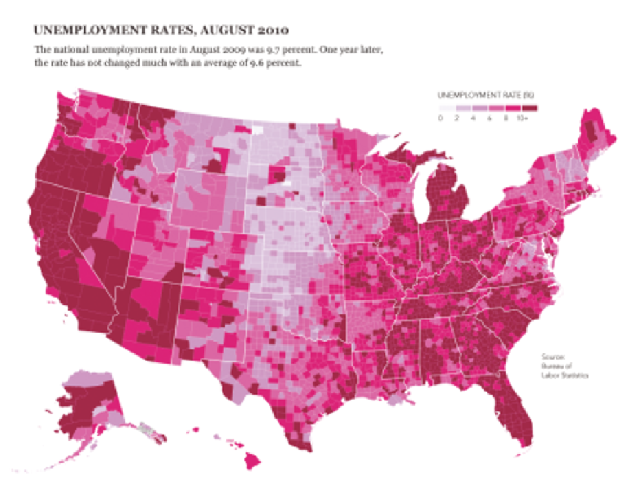
Which color scale you choose depends on that data you have and what
message you want to convey. For this particular dataset, I prefer the lin-
ear scale because it represents the distribution better and highlights the
relatively high unemployment rates across the country. Working from Fig-
ure 8-18, you can add a legend, a title, and a lead-in paragraph for a more
finalized graphic, as shown in Figure 8-20.
FIGurE 8-20
Finished map with title, lead-in, and legend


Search WWH ::

Custom Search