Graphics Programs Reference
In-Depth Information
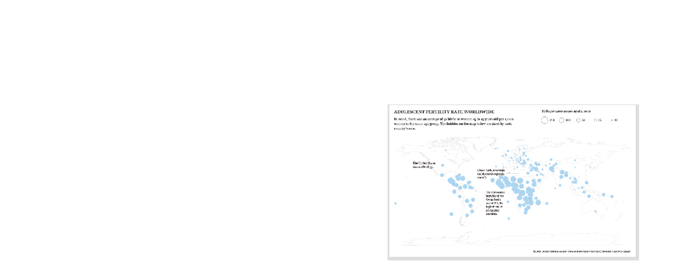
That's fine for us, an audience of one, but you need to explain more
if you want others, who haven't looked at the data, to understand the
graphic. You can add annotation to highlight countries with the highest
and lowest fertility rates, point out the country where most readers will
be from (in this case, the United States), and provide a lead-in to set
up readers for what they're going to look at. Figure 8-10 shows these
changes.
FIGurE 8-10
Rates more clearly explained for a wider audience
regions
Mapping points can take you only so far because they represent only single
locations. Counties, states, countries, and continents are entire regions
with boundaries, and geographic data is usually aggregated in this way.
For example, it's much easier to find health data for a state or a country
than it is for individual patients or hospitals. This is usually done for pri-
vacy, whereas other times aggregated data is just easier to distribute. In


Search WWH ::

Custom Search