Graphics Programs Reference
In-Depth Information
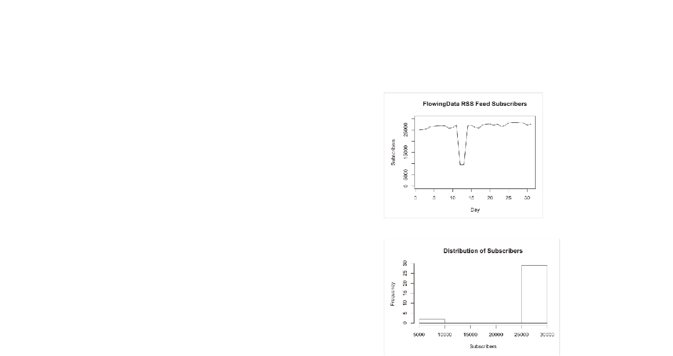
How about the subscriber counts from Chapter 3, “Choosing Tools to Visu-
alize Data,” shown in Figure 7-34? There's that big dip in the middle where
it looks like more than half of FlowingData's readership is lost.
You can also look at the distribution as a whole via a histogram, as shown
in Figure 7-35. All counts are sitting on the right, except for a couple all
the way to the left with nothing in the middle.
FIGurE 7-34
FlowingData subscriber counts over time
FIGurE 7-35
Histogram showing distribution of subscriber counts


Search WWH ::

Custom Search