Graphics Programs Reference
In-Depth Information
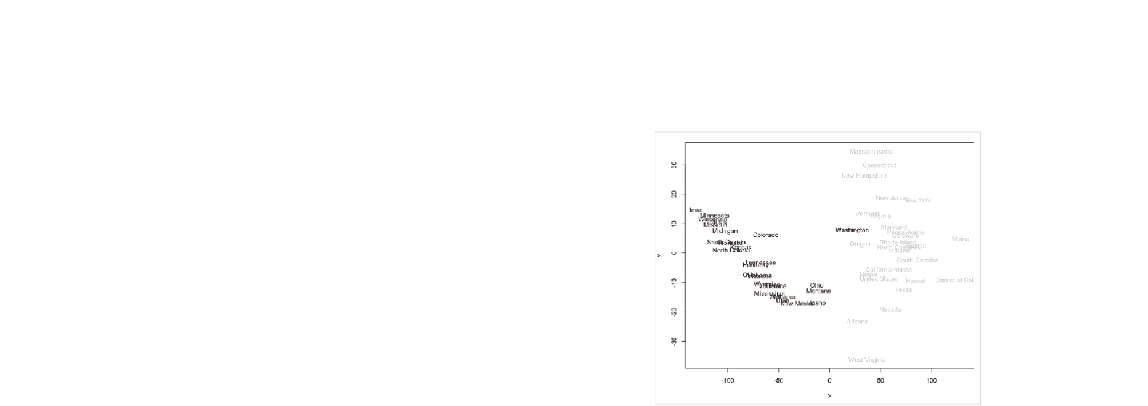
What about states colored by reading scores? Yeah, you can do that, too,
as shown in Figure 7-30. Ah, it looks like there's a clear pattern there.
High scores are on the left and lower scores are on the right? What makes
Washington different? Look into that—you can tell me later.
FIGurE 7-30
States colored by reading scores
If you want to be fancy, you can try something called model-based clus-
tering. I'm not going to get into the details of it. I'll just show you how to
do it, and you can take my word for it that we're not doing any magic here.
There's actual math involved. Basically, use the
mclust
package to identify
clusters in your MDS plot. Install
mclust
if you haven't already. Now run the
following code for the plots in Figure 7-31.
library(mclust)
ed.mclust <- Mclust(ed.mds)
plot(ed.mclust, data=ed.mds)

Search WWH ::

Custom Search