Graphics Programs Reference
In-Depth Information
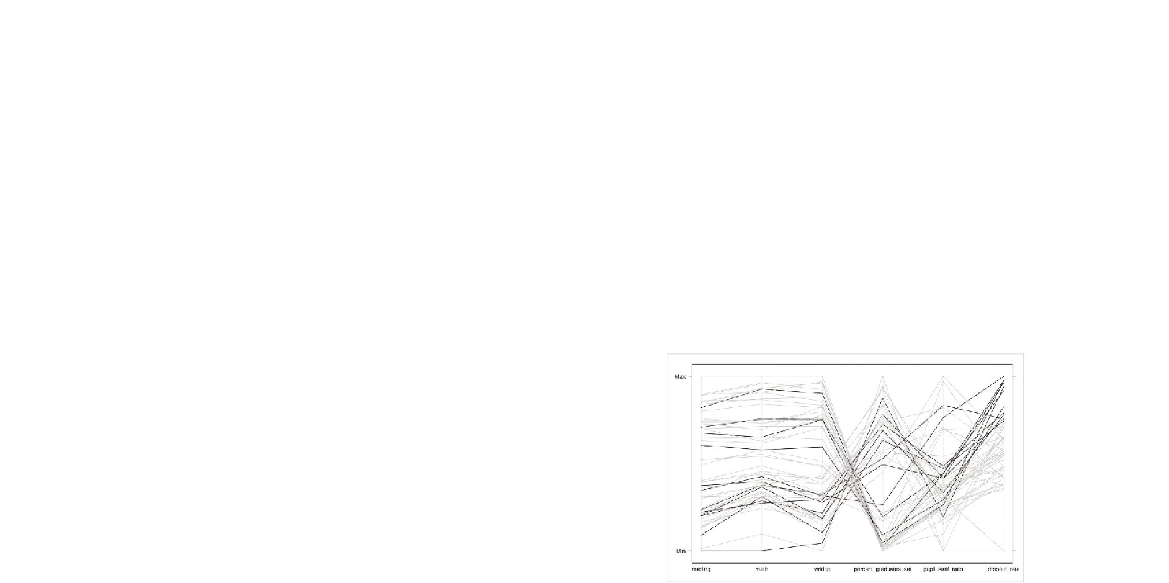
What about dropout rates? What if you do the same thing with drop-
out rates that you just did with reading scores, except you use the third
quartile instead of the median? The quartile is 5.3 percent. Again, you iter-
ate over each row of data, but this time check the dropout rate instead of
reading score.
dropout_colors <- c()
for (i in 1:length(education$state)) {
if (education$dropout_rate[i] > 5.3) {
col <- “#000000”
} else {
col <- “#cccccc”
}
dropout_colors <- c(dropout_colors, col)
}
parallel(education[,2:7], horizontal.axis=FALSE, col=dropout_colors)
Figure 7-25 shows what you get, and it's not nearly as compelling as the
previous graphic. Visually speaking, there aren't any obvious groupings
across all of the variables.
FIGurE 7-25
States with highest dropout rates highlighted

Search WWH ::

Custom Search