Graphics Programs Reference
In-Depth Information
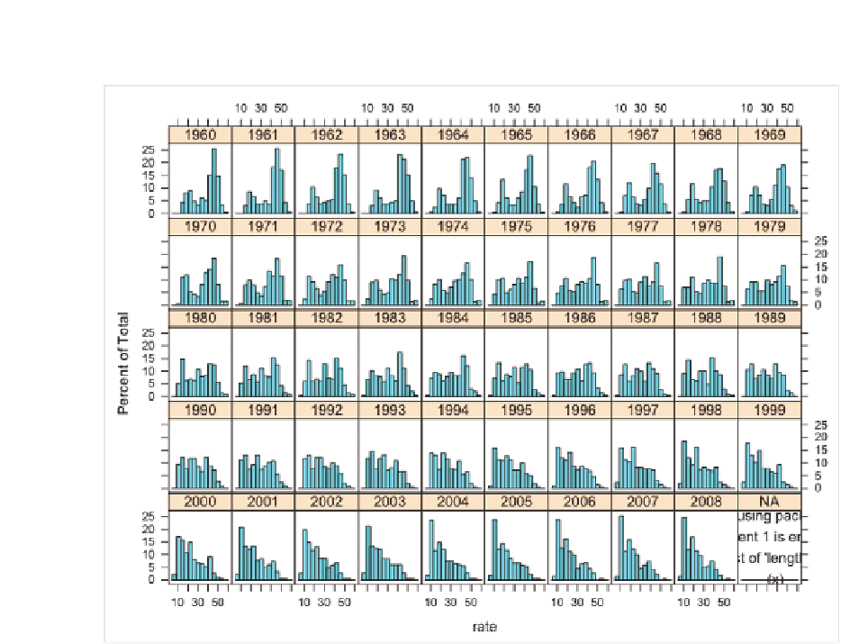
FIGurE 6-34
Modified histogram matrix
At this point, the layout is good. If you were to refine the graphic in Illustra-
tor, you could make the labels smaller, change the border and fill colors,
and do some general cleanup, as shown in Figure 6-35. It's more readable
this way. To make it even clearer, and to complete the story, you can also
add a proper lead-in, include the source, and point out how the distribu-
tion is shifting left toward lower birth rates worldwide. This could be too
complex as a standalone graphic. You'd need to provide a lot of context for
readers to fully appreciate the data.

Search WWH ::

Custom Search