Graphics Programs Reference
In-Depth Information
In the final graphic in Figure 6-24, you can see some of the important fac-
ets of the distribution, namely the median, maximum, and minimum. The
lead-in copy, of course, is another opportunity to explain, and you can add
a little bit of color so that the histogram doesn't look like a wireframe.
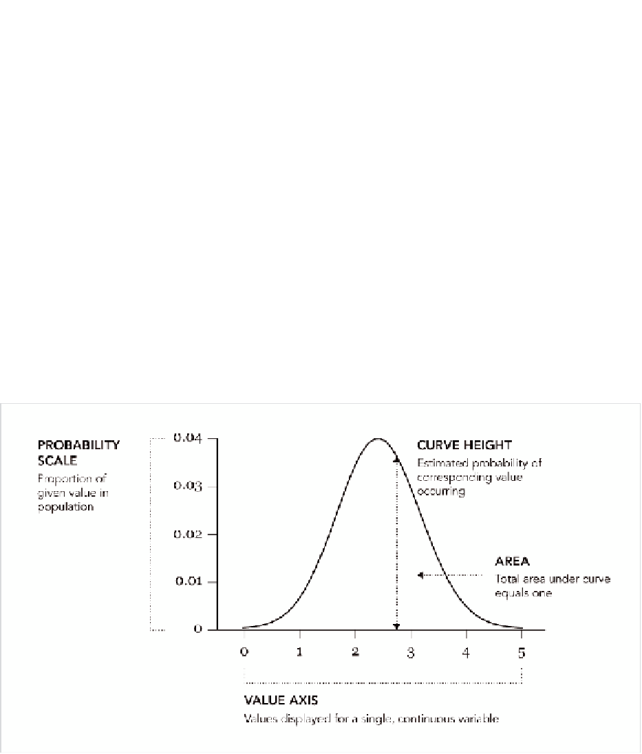
Continuous Density
Although the value axis is continuous, the distribution is still broken up
into a discrete number of bars. each bar represents a collection of items,
or in the case of the previous examples, countries. What sort of variation
is occurring within each bin? With the stem-and-leaf plot, you could see
every number, but it's still hard to gauge the magnitude of differences,
which is similar to how you used Cleveland and Devlin's LOeSS in Chapter
4 to see trends better; you can use a density plot to visualize the smaller
variations within a distribution.
FIGurE 6-28
Density plot framework

Search WWH ::

Custom Search