Graphics Programs Reference
In-Depth Information
The default
number of breaks
for your histogram
isn't always the
best choice. Play
around with the
options and decide
what makes the
most sense for
your particular
dataset.
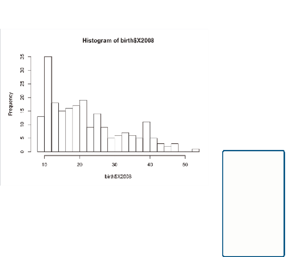
FIGurE 6-27
Histogram with 20 breaks
The number of breaks you should choose depends on the data that you
visualize. If most of your data is clustered toward the beginning, you might
want to have more breaks so that you can see the variations instead of one
high bar. On the other hand, if you don't have that much data or the num-
bers are evenly distributed, thicker bars could be more appropriate. The
good news is that it's easy to change and experiment.
For the purposes of the birth rate data, the default number of breaks is
fine. You can see that there are some countries with birth rates under 10,
but most countries have birth rates between 10 and 25 live births per 1,000
population. A number of countries are also above the 25 mark, but rela-
tively fewer compared to the lower groups.
You can find
mean, median,
maximum, and
quartiles easily
with the
summary()
function in R.
At this point, you can save the output as a PDF and make further edits in
Illustrator. Most of the edits will be similar to what you did with the bar
charts in Chapter 4, but a few things are specific to the histogram that you
can add to make it read better and to explain to readers what the graphic
is about.


Search WWH ::

Custom Search