Graphics Programs Reference
In-Depth Information
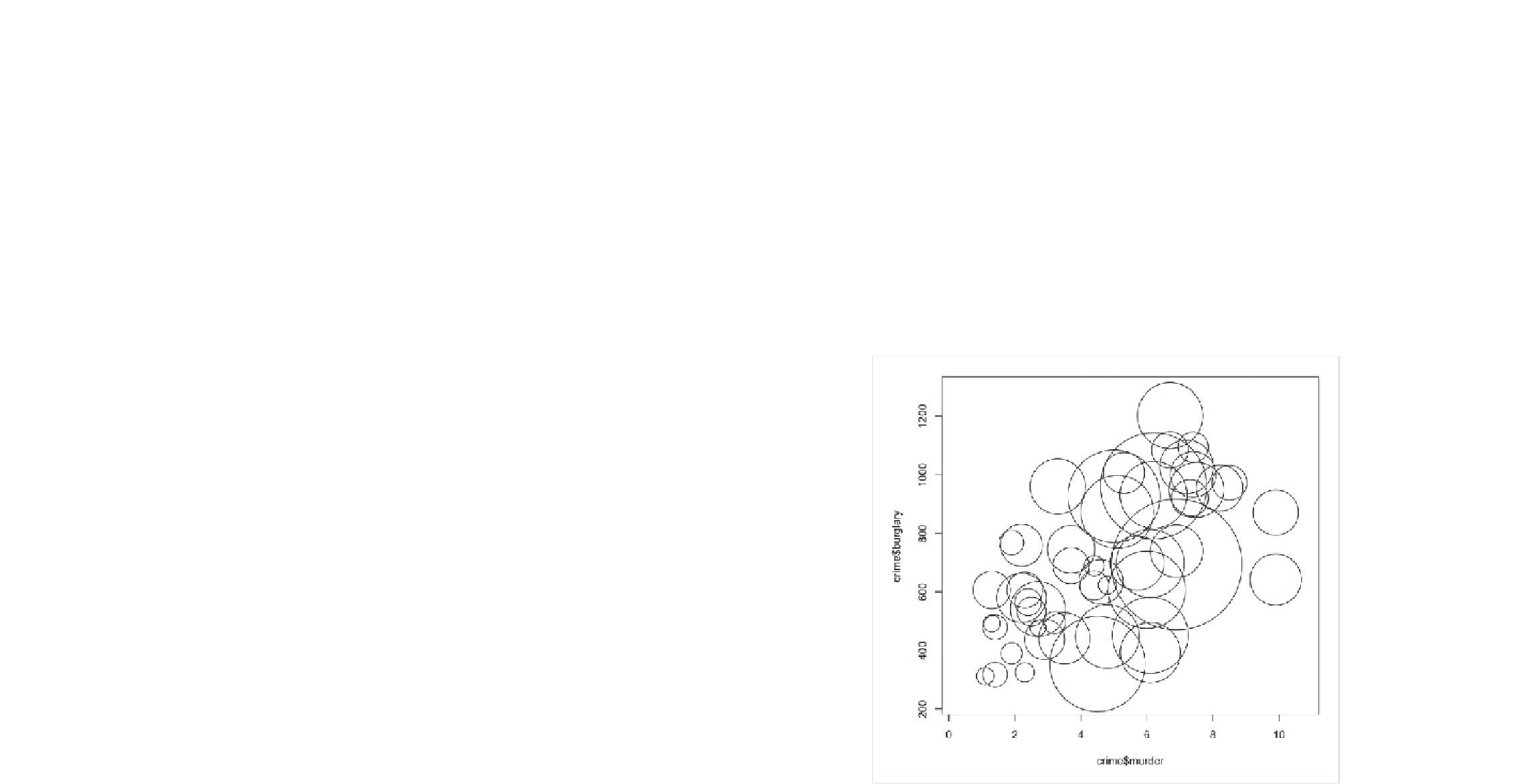
The first row of code simply creates a new vector of square root values
stored in
radius
. Figure 6-17 shows the bubble plot with radiuses sized
correctly, but it's a mess because the states with populations smaller than
California are a little bigger now.
You need to scale down all circles to see what's going on. The
inches
argu-
ment of
symbols()
sets the size of the largest circle in, well, inches. By default
it's 1 inch, so in Figure 6-17 California is sized at 1 inch, and the rest of the
circles are scaled accordingly. You can make the maximum smaller, say 0.35
inches, while still maintaining the right proportions. You also can change
color using
fg
and
bg
to change stroke color and fill color, respectively. You
can also add your own labels to the axes. Figure 6-18 shows the output.
symbols(crime$murder, crime$burglary, circles=radius, inches=0.35,
fg=”white”, bg=”red”, xlab=”Murder Rate”, ylab=”Burglary Rate”)
FIGurE 6-17
Default bubble chart with correctly sized circles

Search WWH ::

Custom Search