Graphics Programs Reference
In-Depth Information
was clicked 100 times. So the first banner performed 50 percent better
than the second. Figure 6-13 shows a circle, sized by area, for each ban-
ner. The circle for the first banner is 50 percent bigger than the second.
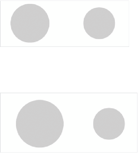
FIGurE 6-13
Bubbles sized by area
In Figure 6-14, you see how the bubbles compare to each other if they are
sized by radius.
FIGurE 6-14
Bubbles sized by radius
The radius for the first circle, representing the first banner, is 50 percent
larger than the radius for the second banner, which makes the area of the
first circle more than twice that of the second. Although this doesn't seem
like a huge deal with only two data points, which are easy to compare, the
challenge becomes more obvious when you use more data.
CrEATE A bubbLE ChArT
Look at the final chart in Figure 6-15 to see what you're making. It's the
same crime data relating murder and burglary rate by state, but popula-
tion is added as a third dimension. Do states with more people have higher
crime rates? It's not clear-cut (as is usually the case). Large states such
as California, Florida, and Texas are near the top-right quadrant, but New
York and Pennsylvania have relatively low burglary rates. Similarly, Loui-
siana and Maryland, which have smaller populations, are far on the right.


Search WWH ::

Custom Search