Graphics Programs Reference
In-Depth Information
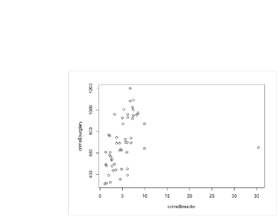
States in 2005 was 140.7 per 100,000 population. Use
plot()
to create the
default scatterplot of murder against burglary, as shown in Figure 6-3.
plot(crime$murder, crime$burglary)
FIGurE 6-3
Default scatterplot of murder against burglary
It looks like there's a positive correlation in there. States that have higher
murder rates tend to have higher burglary rates, but it's not so easy to see
because of that one dot on the far right. That one dot—that outlier—is forc-
ing the horizontal axis to be much wider. That dot happens to represent
Washington, DC, which has a much higher murder rate of 35.4. The states
with the next highest murder rates are Louisiana and Maryland, which
were 9.9.
For the sake of a graphic that is more clear and useful, take out Wash-
ington, DC, and while you're at it, remove the United States averages and
place full focus on individual states.
crime2 <- crime[crime$state != “District of Columbia”,]
crime2 <- crime2[crime2$state != “United States”,]

Search WWH ::

Custom Search