Graphics Programs Reference
In-Depth Information
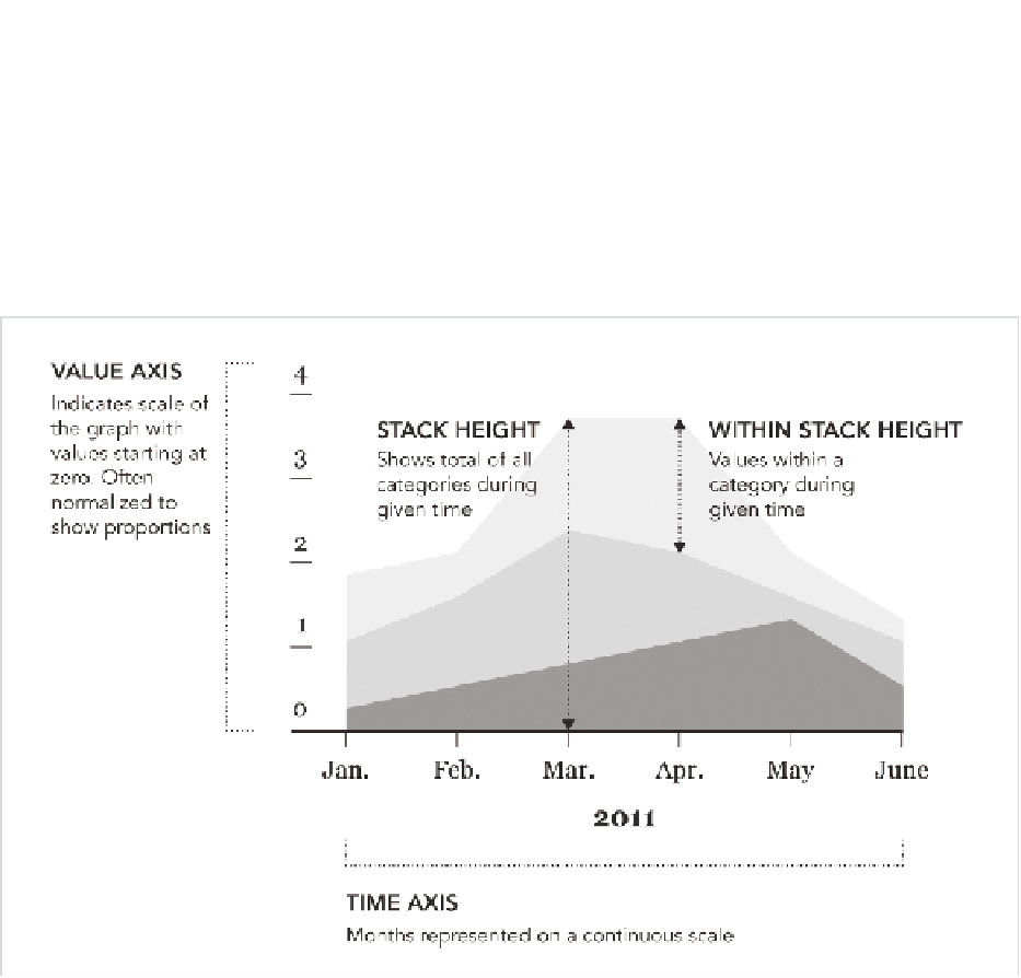
Stacked Continuous
Imagine you have several time series charts. Now stack each line on top
of the other. Fill the empty space. What you have is a stacked area chart,
where the horizontal axis is time, and the vertical axis is a range from 0 to
100 percent, as shown in Figure 5-20.
FIGurE 5-20
Stacked area chart generalized
So if you were to take a vertical slice of the area chart, you would get the
distribution of that time slice. Another way to look at it is as a series of
stacked bar charts connected by time.
CrEATE A STACkED ArEA ChArT
In this example, look at the aging population. Download the data at
http://
book.flowingdata.com/ch05/data/us-population-by-age.xls
. Medicine and
healthcare have improved over the decades, and the average lifespan

Search WWH ::

Custom Search