Graphics Programs Reference
In-Depth Information
Choose the Direct Selection tool in the Tool window, and then click a
wedge. Change fill and stroke color via the controls in the Color window.
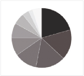
Figure 5-5 shows the same pie chart with a white stroke and wedges col-
ored from darkest to lightest. Now it's easier to see that numbers go from
greatest to least, with the exception of the last wedge for Other.
When you use
opacity, the fill of
the shape you are
changing will blend
with the color of
the background.
In this case, the
background is
white, which gives
a faded look the
higher the trans-
parency. If, how-
ever, the back-
ground were blue,
the shape would
appear purple.
Of course, you don't have to be so frugal
with your colors. You can use whatever
colors you want, as shown Figure 5-6.
Although it's usually a good idea to not
use colors that are bright—you don't want
to blind your readers. If a blinding color
scheme fits with your topic though, go wild.
Because this is a FlowingData poll, I used
the shade of red from the FlowingData
logo and then made lighter color wedges
by decreasing opacity. You can find the
option in the Transparency window. At 0
percent opacity, the fill is completely see-
through; at 100 percent opacity, the fill is
not see-through.
FIGurE 5-5
Pie chart with colors
arranged darkest to lightest
Finally, add a title, a lead-in sentence, and
labels for the graph with the Type tool.
With practice, you can have a better idea
what fonts you like to use for headers and
copy, but whatever you use, Illustrator's
alignment tools are your best friend when
it comes to placing your text. Properly
aligned and evenly spaced labels make
your charts more readable. You can also
make use of the Pen tool to create point-
ers, as shown in Figure 5-7, for the last three poll categories. These sec-
tions are too small to put the labels inside and are too close together to
place the labels adjacent.
FIGurE 5-6
Colored pie chart


Search WWH ::

Custom Search