Graphics Programs Reference
In-Depth Information
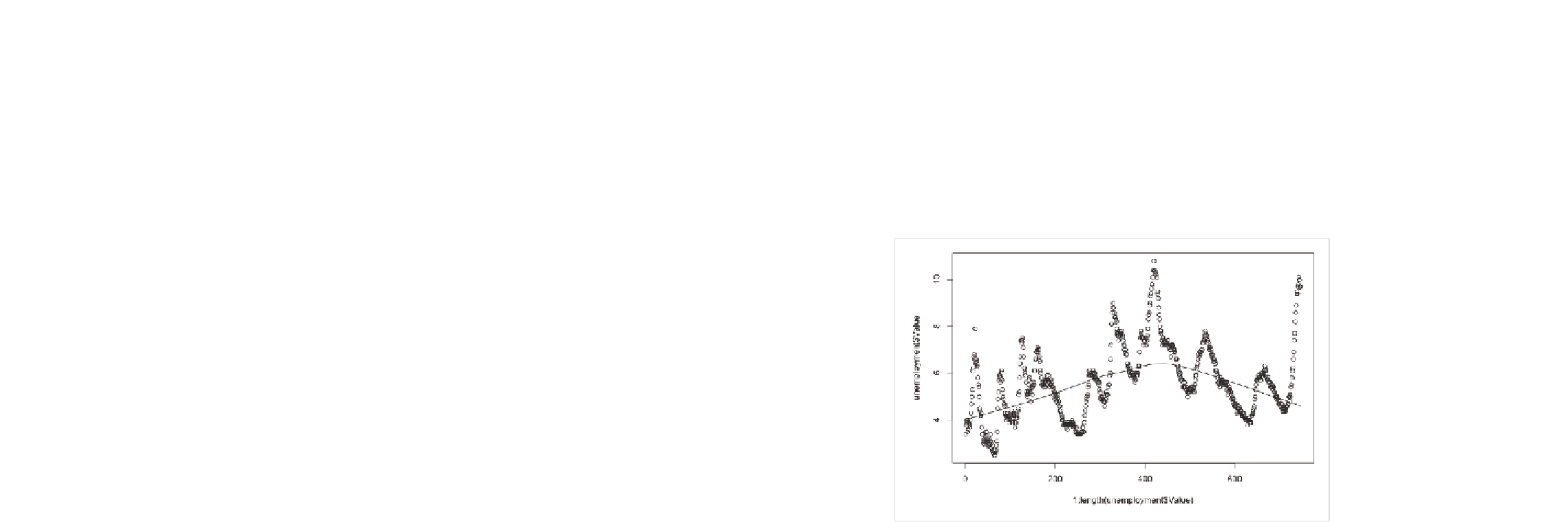
It's not helpful. It looks as if it ignores all the fluctuations in the unem-
ployment rate. To fit a LOeSS curve instead, you use the
scatter.smooth()
function.
scatter.smooth(x=1:length(unemployment$Value), y=unemployment$Value)
You can see the result in Figure 4-50. The line curves up now, accounting
for the spike in the 1980s. That's a little better.
FIGurE 4-50
Fitting a LOeSS curve
You can adjust how fitted the curve is via the degree and span arguments
in the
scatter.smooth()
function. The former controls the degree of the
polynomials that are fitted, and the latter controls how smooth the curve
is. The closer the span is to zero, the closer the fit. Figure 4-51 is what you
get if you change degree to 2 and span to 0.5. Now change the colors and
adjust the axis limits.
scatter.smooth(x=1:length(unemployment$Value),
y=unemployment$Value, ylim=c(0,11), degree=2, col=”#CCCCCC”, span=0.5)
The ups and downs of the curve are more prominent with these settings.
Try messing around with span to get a better feel for how it changes
smoothness.

Search WWH ::

Custom Search