Graphics Programs Reference
In-Depth Information
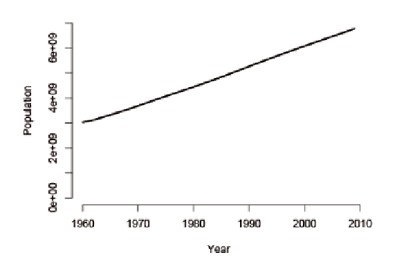
Here's what the first few rows of the data look like. It's just the year and
population.
Year Population
1 1960 3028654024
2 1961 3068356747
3 1962 3121963107
4 1963 3187471383
5 1964 3253112403
Use the
plot()
function and specify the X- and Y-coordinates, the type, the
value axis limits, and axis labels.
plot(population$Year, population$Population, type=”l”,
ylim=c(0, 7000000000), xlab=”Year”, ylab=”Population”)
Your chart will look like Figure 4-34.
FIGurE 4-34
Default time series chart in R
At this point, you can save the image as a PDF and edit it in Illustrator like
you've done a couple of times, but now try something else. Design the entire
chart in Illustrator with the Line Graph tool. This is one of several graphing
tools in Illustrator that enables you to create basic charts (Figure 4-35).
FIGurE 4-35
Graph tools in Illustrator


Search WWH ::

Custom Search