Graphics Programs Reference
In-Depth Information
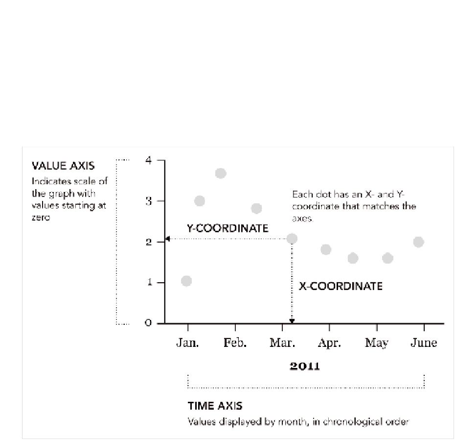
Points
Sometimes it makes more sense to use points instead of bars. They use
less space and because there are no bins, points can provide a better
feeling of flow from one point to the next. Figure 4-24 shows the common
geometry when using points to graph temporal data.
FIGurE 4-24
Framework for using points to chart
This type of chart is commonly known as a scatterplot and you can also
use it to visualize nontemporal data. It's often used to show the relation-
ship between two variables, which is covered in Chapter 6, “Visualizing
Relationships.” For temporal data, time is represented on the horizontal
axis, and values or measurements are represented on the vertical axis.
Unlike the bar graph, which uses length as the visual cue, scatterplots
use position. You can think of each point with an X- and Y-coordinate, and
you can compare to other points in time based on where they are placed.

Search WWH ::

Custom Search