Graphics Programs Reference
In-Depth Information
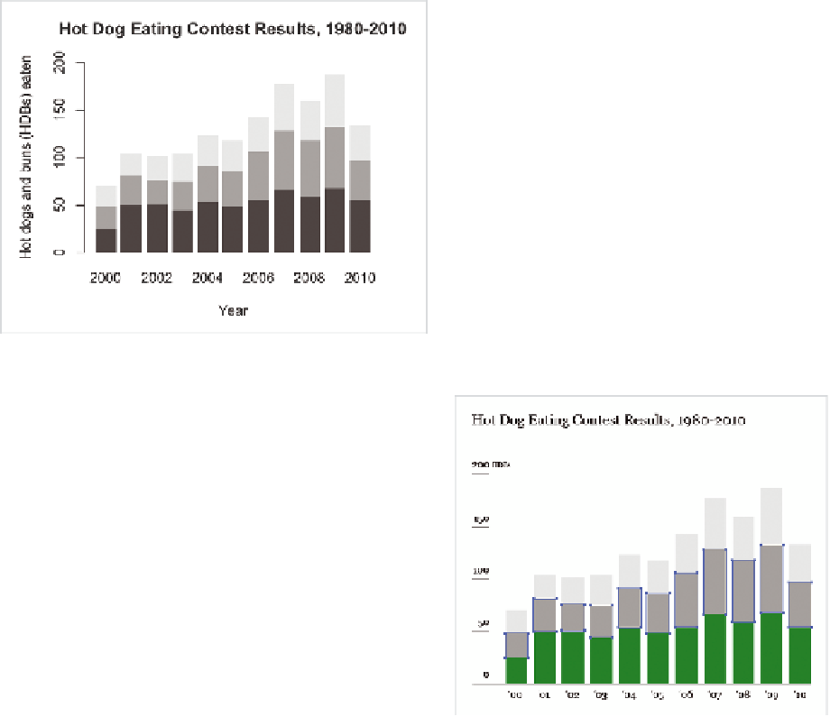
You stored our newly created matrix as
hot_dog_matrix
. You can pass this
into
barplot()
.
barplot(hot_dog_matrix, border=NA, space=0.25, ylim=c(0, 200),
xlab=”Year”, ylab=”Hot dogs and buns (HDBs) eaten”,
main=”Hot Dog Eating Contest Results, 1980-2010”)
You specified no borders around the bar, spacing to be 0.25 the width of
bar width, and the limits of the value axis to go from 0 to 200, along with
title and axis labels. Figure 4-22 is the result.
FIGurE 4-22
Stacked bar chart using R
Not bad for a few lines of code, but you're not quite
done. Now you can refine. Save the image as a PDF
and open it in Illustrator. Use the same tools that
you did before. You can add text with the Type tool,
change fonts, simplify the vertical axis, edit colors
with the ability to select elements with the same fill,
and of course include the data source (Figure 4-23).
Add some lead-in text and change the title to what
you want, and Figure 4-21 shows the final result.
The next chapter covers the stacked bar chart's
continuous cousin: the stacked area chart. The
geometry is similar; just imagine if you connected
all the stacks for a continuous flow.
FIGurE 4-23
edits in Illustrator


Search WWH ::

Custom Search