Graphics Programs Reference
In-Depth Information
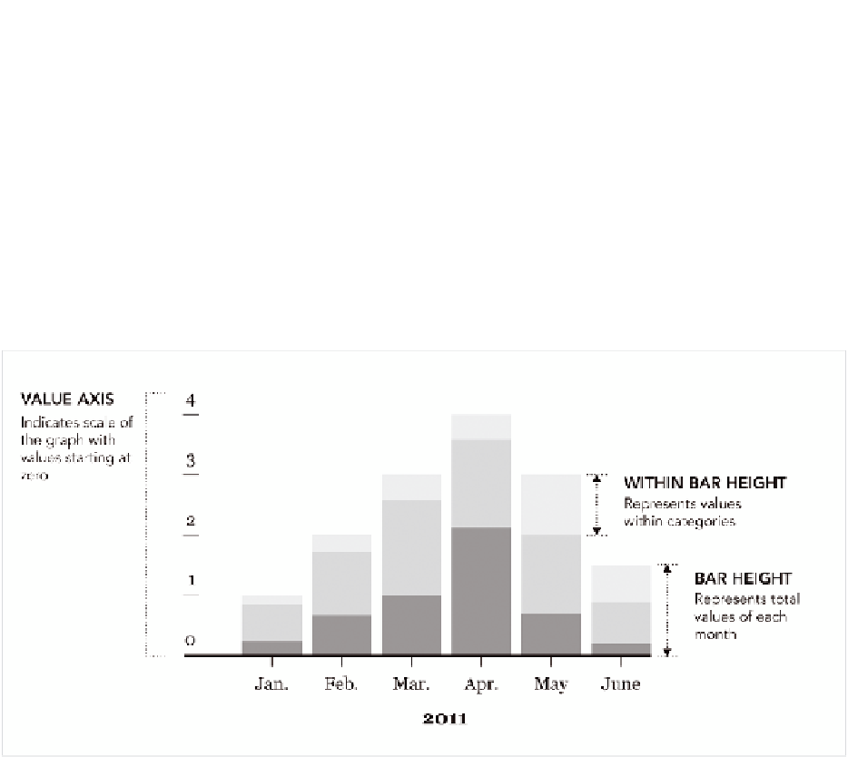
Stack the Bars
As shown in Figure 4-20, the geometry of stacked bar charts is similar to
regular bar charts. The difference of course is that rectangles are stacked
on top of each other. You use stacked bar charts when there are subcat-
egories, and the sum of these subcategories is meaningful.
Like bar charts, stacked bar charts are not just for temporal data; they
can be used for more categorical data. But in Figure 4-19, for example, the
categories are months.
FIGurE 4-20
Framework for stacked bar charts
CrEATE A STACkED bAr ChArT
Because the stacked bar chart is a relatively common chart type, there are
plenty of ways to make one (like its unstacked sibling), but here's how to do
it in R. Follow a similar process to what you did to make a regular bar chart.
1.
Load the data.
2.
Make sure the data is properly formatted.
3.
Use an R function to produce a plot.
This is generally what you'll do every time you use R to make data graph-
ics. Sometimes you'll spend more time on one part than the other. It might

Search WWH ::

Custom Search