Graphics Programs Reference
In-Depth Information
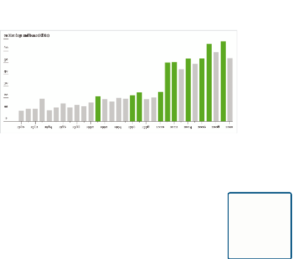
FIGurE 4-19
Changing color of graph elements
Using the Type tool, found in the Tools window, you can add text boxes to
the graphic. This is your chance to explain what readers are looking at
in your graphic and to clarify any spots that might seem unclear. Choose
fonts that you think will work, using size and style to differentiate the label
from graph elements like axis labels.
Always include
your data source
in your graphics. It
not only provides
credibility but also
context.
In the case of this ever important hot dog graphic, highlight the first record
since 1980, Takeru Kobayashi's dominance, and Joey Chestnut's cur-
rent reign. Also include a title and a lead-in that explains the gist of the
graphic.
Last but not least: Remember to include the data source. There's no way
to tell if your graphic is accurate otherwise.
Put all this together, and you have the final graphic, as shown in
Figure 4-5.
I know this was a lot to take in, but it gets much easier as you work on
more graphics. You'll see how coding in R, or any language for that mat-
ter, follows a certain pattern, and although Illustrator has a huge toolset,
you'll just learn the ones that pertain to the task at hand.
The following examples look at other charting types for temporal data and
spend more time with R and Illustrator. They'll go by quicker now that you
covered some of the basics of the two tools.


Search WWH ::

Custom Search