Graphics Programs Reference
In-Depth Information
to make your graph into a standalone graphic, you can do some things to
make it more readable.
Put yourself in a
reader's shoes
when you design
data graphics.
What parts of
the data need
explanation?
Now look at this from a storytelling perspective. Pretend Figure 4-11 was
by itself, and you're a reader who came across it somehow. What can you
glean from the basic graph? You know the graph shows hot dogs and buns
eaten by year. Is this one person's eating habits? That sure is a lot of hot
dogs for one person. Is it food for animals? Are leftovers given to birds? Is
it the average number of hot dogs eaten per person per year? Why are the
bars colored?
As the one who made the graph, you know the context behind the num-
bers, but your readers don't, so you have to explain what's going on. Good
data design can help your readers understand the story more clearly.
Illustrator, which enables you to manipulate individual elements by hand,
can help you do that. You can change fonts, add notes, modify axes, edit
colors, and pretty much do whatever your imagination allows.
If you don't have
Illustrator, you can
try InkScape, the
free and open-
source alternative.
Although the
functions or
buttons might not
look exactly the
same as Illustrator,
you can still find
many of the same
things in InkScape.
This topic keeps the editing in Illustrator simple, but as you work
through more examples, and start to design your own graphics,
you'll see how these small changes can be a big help to make
your graphic clear and concise.
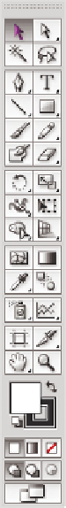
First things first. Open the PDF file of your bar graph in Illus-
trator. You should see the graph you made in one window, and
then there will most likely be several smaller windows with
tools, colors, and fonts, among other things. The main window
to make note of is the Tools window, as shown in Figure 4-12.
You'll use this often. If you don't see the Tools window, go to the
Window menu and click Tools to turn it on.
Illustrator, you can
try InkScape, the
free and open-
source alternative.
Although the
functions or
buttons might not
look exactly the
same as Illustrator,
you can still find
many of the same
things in InkScape.
If you don't have
The black arrow is called the Selection tool. Select it, and your
mouse pointer becomes a black arrow (if it wasn't already).
Click-and-drag over the border. The borders appear high-
lighted, as shown in Figure 4-13. This is known as a clipping
mask in Illustrator. It can be useful in various situations, but
you don't care about it now, so press Delete on your keyboard to
get rid of it. If this deletes the entire graphic, undo the edit, and
use the Direct Selection tool, which is represented by a white
arrow, to highlight the clipping mask instead.
FIGurE 4-12
Tool is
window in
Illustrator


Search WWH ::

Custom Search