Java Reference
In-Depth Information
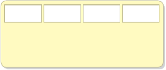
Note that although the panel used to display the buttons has a green back-
ground, no green is visible in the display for Listing 7.21. By default there are no
horizontal or vertical gaps between the areas of a border layout. These gaps can be
set with an overloaded constructor or with explicit methods of the
BorderLayout
class. If the gaps are increased, the underlying panel will show through.
A
grid layout
presents a container's components in a rectangular grid of rows and
columns. One component is placed in each grid cell, and all cells are the same size.
Figure 7.9 shows the general organization of a grid layout.
The number of rows and columns in a grid layout is established using parameters
to the constructor when the layout manager is created. The class in Listing 7.22
shows the panel used by the
LayoutDemo
program to demonstrate a grid layout.
It specifies that the panel should be managed using a grid of two rows and three
columns.
As buttons are added to the container, they fill the grid (by default) from left
to right and top to bottom. There is no way to explicitly assign a component to
a particular location in the grid other than the order in which they are added to
the container.
The size of each cell is determined by the container's overall size. When the
container is resized, all of the cells change size proportionally to fill the container.
If the value used to specify either the number of rows or the number of columns
is zero, the grid expands as needed in that dimension to accommodate the number
of components added to the container. The values for the number of rows and
columns cannot both be zero.
Component
1
Component
2
Component
3
Component
4
Component
5
Component
6
Component
7
Component
8
Component
9
Component
10
Component
11
Component
12
FIGURE 7.9
Grid layout creates a rectangular grid of equal-sized cells

Search WWH ::

Custom Search