HTML and CSS Reference
In-Depth Information
■
in order to get the full documentation with examples of primeFaces, you can check the user guide documentation
from
http://primefaces.org/documentation.html
. You can access the complete primeFaces showcase that includes an
Note
Integrating and Customizing PrimeFaces
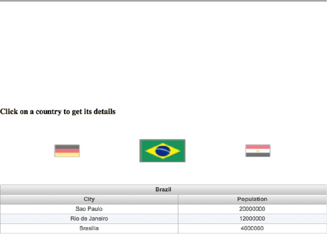
The Country Navigator application is a PrimeFaces application which allows the user to get the available list of cities
(with some information) for one of the available countries after clicking on the flag of any of the available countries as
shown in Figure
9-1
.
Figure 9-1.
County Navigator application
As shown in the screenshot, the application page consists of mainly two UI components:
1.
Ring
component, which displays the list of available countries (Germany, Egypt,
and Brazil).
2.
DataTable
component, which displays the list of available cities for the selected country.
Listing 9-1 shows the code snippet which represents the ring component that displays the list of available
countries.
Listing 9-1.
Ring Component Displaying Different Countries
<p:ring id="custom" value="#{countryNavigator.countries}" var="country"
styleClass="image-ring" easing="swing">
<p:commandLink update=":form:detail">
<p:graphicImage value="/images/#{country.name}.gif"
styleClass="flagIcon" />
<f:setPropertyActionListener value="#{country}"
target="#{countryNavigator.activeCountry}" />
</p:commandLink>
</p:ring>