HTML and CSS Reference
In-Depth Information
As we see in the listing, the listener method has
ComponentSystemEvent
as a parameter. Using
getComponent()
,
we can retrieve the component instance and then we check if the component is valid (passes validation phase) using
isValid()
method of
EditableValueHolder
. If the component is not valid, then
invalidInput
CSS style class is added
to the
styleClass
attribute of the component. The
invalidInput
CSS style class is simple, as shown in Listing 4-24.
Listing 4-24.
invalidInput Style Class
.invalidInput {
background-color: red;
color: white;
}
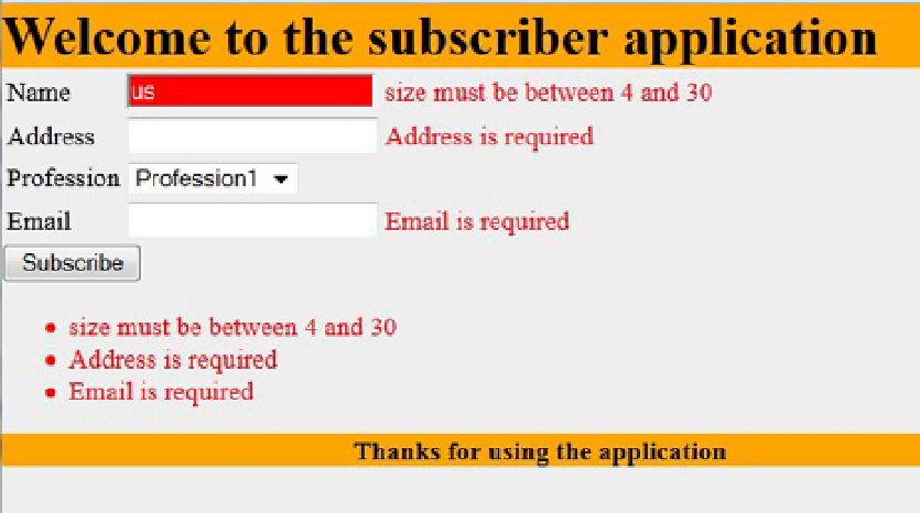
Figure
4-9
shows how the user name input field looks like when it does not pass the validation.
Figure 4-9.
Styling the user name input field when an error occurs
Installing component System event listener on every input component using
<f:event>
for styling these input
elements in case of having errors may not be efficient and will make us have a lot of duplication in all the application
forms. So, we need a unified and simple way in our JSF application to control the error display in all of the input field.
In order to unify the control of the error display in all of the input fields, we can create a custom System event
listener on
PostValidateEvent
and apply it to all input text elements in the application by setting input text class as
the event source. Listing 4-25 shows
ErrorDisplayListener
class (our custom System event listener class).
Listing 4-25.
ErrorDisplayListener Class
package com.jsfprohtml5.subscriber.model;
import javax.faces.component.EditableValueHolder;
import javax.faces.component.UIComponent;
import javax.faces.event.AbortProcessingException;
import javax.faces.event.SystemEvent;
import javax.faces.event.SystemEventListener;