HTML and CSS Reference
In-Depth Information
The max-device-width and min-device-width media characteristics are dependent on the
actual screen size of the device (
not
the width of your browser window). What if you are
more concerned with the size of the browser? Well, you can use the
max-width
and
min-
width
properties instead, which represent the maximum and minimum width of the browser
window itself (not the screen size). Let's see how this works: In your “chapter9/lounge” folder,
you'll find “lounge-mobile.css”. Open up your lounge.html file again, and change the <link>
elements in the <head> of the document to look like this:
<link type="text/css" rel="stylesheet" href="lounge.css"
media="screen and (min-width: 481px)">
<link type="text/css" href="lounge-mobile.css" rel="stylesheet"
media="screen and (max-width: 480px)">
<link type="text/css" href="lounge-print.css" rel="stylesheet" media="print">
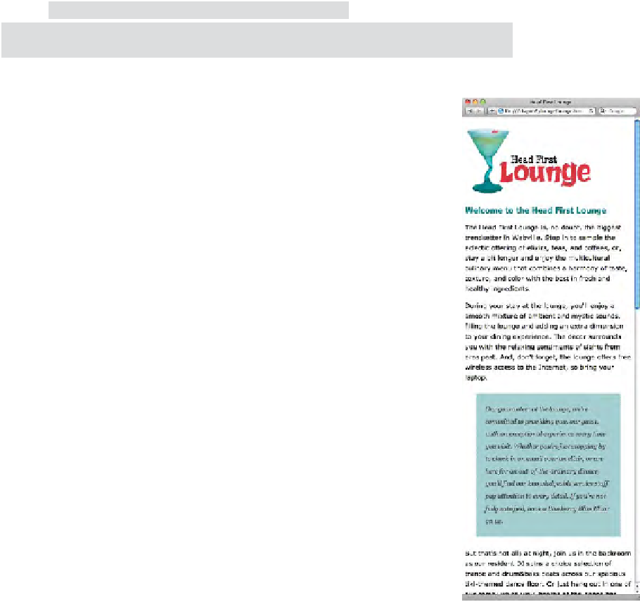
Now, reload the “lounge.html” page in your browser. Make sure the
browser window is nice and big. You should see the lounge page as
normal.
Next, make your browser window narrow (less than 480 pixels). What
happens to the lounge page? Do you notice a difference? Describe
below what happens when you make the web page narrow and load
the page. Why is this version of the page better for mobile browsers?
When we
make the loun
ge page narrowe
r
than 48
0 pixels, the g
uarantee paragr
aph
changes
style. The righ
t margin gets
reduced
from 250px t
o 30px (to mat
ch
the rest
of the margin
); the backgrou
nd
star ima
ge disappears, a
nd the extra
padding
on the left go
es away too.
This version will wo
rk better for mobile
browsers because t
he guarantee paragraph
gets too narrow w
ith the CSS that's
designed for wider
screens. By removing
the background im
age and the extra
margin and paddin
g, the paragraph is easier
to read. And it's r
eally the content that
matters at the en
d of the day, right?