Information Technology Reference
In-Depth Information
vices. In shops, barcodes and URLs serve as links to product details and the endless aisle. In air-
ports, mobile phones let us check in, swap seats, find gates, and make connections we'd never
have made before. The rollout of cross-channel services is fast and near invisible, so we need
paths and maps to help us see what's possible. As Andy Polaine suggests in
Service Design
, the
space-time “in between” deserves more of our attention.
It is much easier to focus design effort on the boxes because they represent tangible touchpoints - the
website, the ticket machine, and so on - but most people forget to think about designing the experience of
the arrows, which are the transitions from one touchpoint to the next.
l
xxi
Links afford movement in space and time and help us make what we can barely imagine. In
augmented reality with a heads-up display, places are links to people, content, and services. We
must be careful where we step. And in the Internet of Things, objects are links to their own stor-
ies, spime that may change culture by absorbing externality. The service evidence of folded toilet
paper is but a sign of things to come.
As discrete products shift into service ecosystems, our information shadows grow, and so do
complexity and confusion. We will need the limits of paths, the myths of maps, and the
serendipity of ourselves to make sense. We will also need a remembrance of things past, from
transclusion to transpointing windows, since meaning is lost in translation, and memory isn't
nearly as reliable as seeing connections side by side. In the futures of user experience and service
design, the architecture of cross-channel links is critical. The boxes still matter, but it's the ar-
rows that amplify their consequence.
Loops
The business theorist Karl Weick tells managers to shift from nouns to verbs, from organization
to organizing. We'd do well to heed his words. As information architects, we must marry our
passion for structure and semantics with an appreciation for the causal arrows of time. We
might begin by dusting off old diagrams, asking what each map is made to show and hide. For
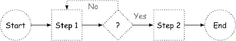
instance, a process flow makes it look simple, defining major actions and decisions as steps, but
the linearity may be deceptive, its purpose to hide politics and mess.
Figure 3-5. A flow diagram shows tasks and decisions as steps.
A Gantt chart gets us on schedule, making deadlines and dependencies our aim. It shows con-
currency nicely, but quality may go down the drain.
Search WWH ::

Custom Search