HTML and CSS Reference
In-Depth Information
Link Hover Behavior
The mere position and presentation of the links should be enough to convince anyone browsing
the site that these are indeed links that can be clicked on. However, you can always reinforce
this behavior by providing a hover style (using the
:hover
pseudo-class). For this block of navi-
gation, we could invert the color scheme so that the background darkens and the text turns
white. Because the border is applied to the link, you can also affect that aspect of the design.
But let's not stop there—let's throw in another trick we introduced earlier in this chapter: the
background image. We could use the same arrow image that's used in the breadcrumb trail in
the header and make it appear on hover. Here's the CSS that achieves all of these aims:
#navigation li {
margin:0 0 0 10px;
width:8em;
}
#navigation li a {
display:block;
border-bottom:1px solid #033;
text-decoration:none;
padding:2px 2px 2px 5px;
}
#navigation li a:hover {
background:#009f9f url(arrow.gif) no-repeat 2px center;
color:#fff;
border-bottom:1px solid #000;
padding:2px 2px 2px 14px;
}
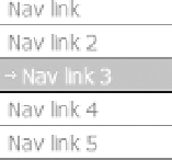
You can see the final result in Figure 12-14, which shows how a link looks when the mouse
hovers over it (the mouse cursor does not appear in the screen shot, but it was there a-hoverin'!).
Figure 12-14.
The styled navigation list
We'll take a shortcut now and get straight to a solution for the right-hand navigation list.
It's similar to the previous example, but because the links are contained in the rounded-corner
box, we'll go a little easier on the styling. The bottom border can go, but we'll place the arrow
background image next to each of the links in their “static” state as well as hover: