HTML and CSS Reference
In-Depth Information
■
Tip
Just as you can use the
max-width
CSS property to set upper width constraints, you can also apply
limits the other way using the
min-width
property. Try amending the code and see the effect for yourself.
Resolution-Dependent Layouts
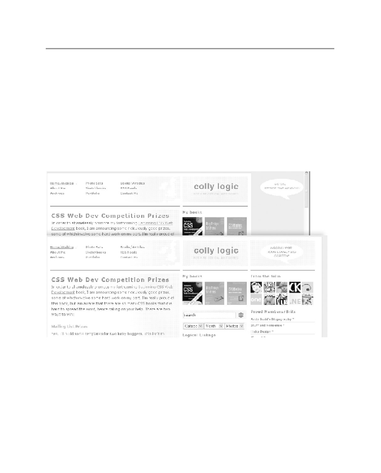
An interesting technique that you might like to employ is the
resolution-dependent
layout.
(Actually, that's a bit of a misnomer, as it's not the resolution of your monitor but the size of
the window in which you're currently viewing a web site that we're interested in.) With this
technique, you display one view of your page as a default (normally a smaller window size)
but for users who are viewing the site in a large window, you display an adapted design that
maximizes that space available. This layout is not the same as a liquid layout, which resizes
continually as you move the browser window's sides around; instead, once a “trigger” point is
reached the layout changes and affects the content. You can see a good example of this tech-
nique on Simon Collison's web site CollyLogic (
www.collylogic.com/
), as shown in Figure 7-13.
Figure 7-13.
Simon Collison's adaptable page layout on CollyLogic.com
On his site, Simon uses a combination of
•
CSS (for the default styling options)
•
JavaScript (to check for window resize events)
•
DOM scripting ( JavaScript that dynamically changes CSS display property values of the
affected elements)