Global Positioning System Reference
In-Depth Information
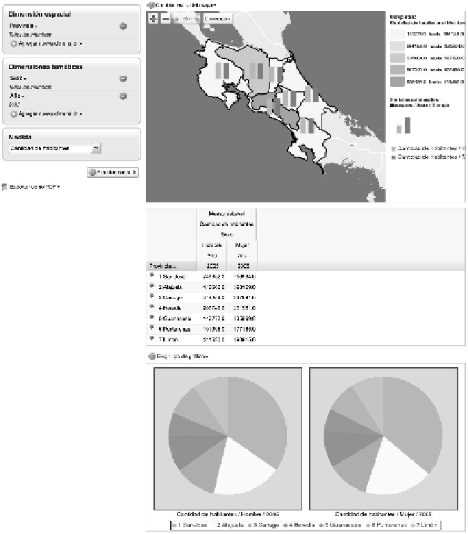
An example is given in Fig. 13 showing the distribution of population in
2005 according to gender. Maps allow two types of displays: simultaneous
(as shown in Fig. 13) or separate: (1) the traditional coloring method
indicating different ranges for population, independently for female
and male distribution and/or (2) the bars (or pies) for each province
indicating the female/male distributions that are placed over each province.
Furthermore, in the lower part of the display, the table with aggregated
data is also included and optionally two different graphs for comparing the
female and male distributions among seven Costa Rican provinces (other
displays are also available) can be requested.
Fig. 13.
An example of displaying the results of the SOLAP query.
Color image of this figure appears in the color plate section at the end of the topic.
Search WWH ::

Custom Search