HTML and CSS Reference
In-Depth Information
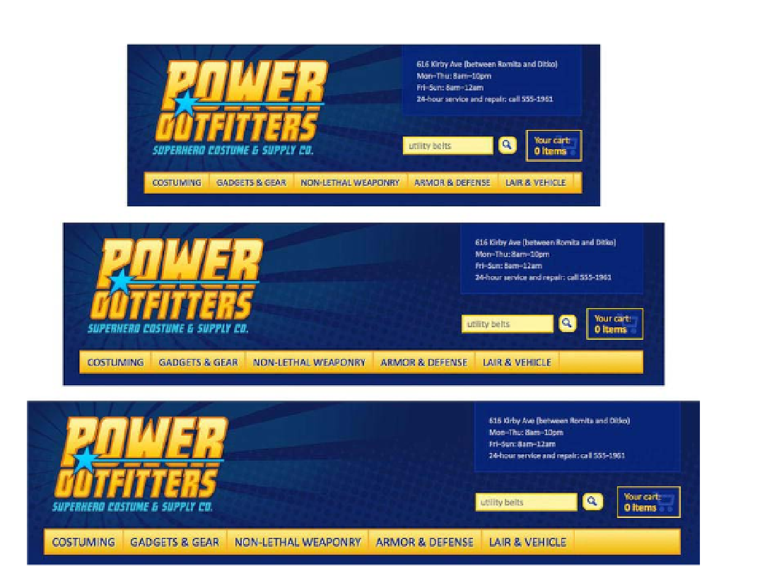
Figure 10-35.
The navigation resizes to fit the viewport
This is a rather simplistic demonstration of what media queries can do. The rising ubiquity of smartphones
and tablets means more people are accessing the Web on small-screen devices every day. With media
queries, fluid images, and a flexible layout, you can construct a website that responds and adapts to the
viewport, shifting and rearranging elements to optimize the experience for the full spectrum of web-capable
devices.
Figure 10-36 shows the website for dConstruct 2012, an annual technology and culture conference in
Brighton, England (
http://2012.dconstruct.org
). Th
e layout shifts and adjusts to different viewport
sizes from mammoth, high-definition desktop monitors to pocket-sized smartphones. This is a shining
example of responsive design using a flexible layout, fluid images, and CSS3 media queries.