HTML and CSS Reference
In-Depth Information
Unless otherwise specified, the gradient's center point will be the center point of the element. You can
instead specify the position of a radial gradient's center point just as you would specify
background-
position
:
.orb {
width: 350px;
height: 200px;
background-image: radial-gradient(
50px 50px
, cyan, indigo);
}
The colors will spread in 360 degrees from the center point to fill the entire element, forming an ellipse to fit
the element's dimensions. There are a number of other arguments to control the way the colors spread
and the shape it forms. For example, the CSS rule in Listing 10-33 will produce the gradient image you see
in Figure 10-33.
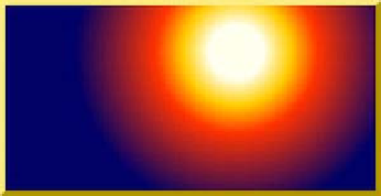
Listing 10-33.
A radial gradient with four colors
.dusk {
width: 400px;
height: 200px;
border: 6px outset gold;
background-color: #006;
background-image: radial-gradient(250px 50px, circle farthest-corner,
#ffe 10%, #fc0 20%, #f30 30%, #006 60%);
}
Figure 10-33.
A simulated sunset generated with CSS. Take our word for it: the colors are breathtaking.
A third type of gradient we haven't mentioned yet is the
repeating gradient
: a linear or
radial gradient of a fixed length that can repeat as many times as necessary to fill the
element. In a word: stripes. You can read about the
repeating-linear-gradient
and
repeating-radial-gradient
functions at the Mozilla Developer Network
(
https://developer.mozilla.org/docs/CSS/repeating-linear-gradient
and
Media Queries
We first mentioned media queries in Chapter 3 where they appeared in a
link
element's
media
attribute.
A media query is an extension of long-standing media types, allowing web developers to tailor style rules
for specific media properties, such as a minimum window width, a maximum screen resolution, or even a