HTML and CSS Reference
In-Depth Information
Lastly,
border-radius
with four values will round off each of the four corners clockwise in the order of top
left, top right, bottom right, and bottom left:
.pillow { border-radius: 10px 30px 12pt 1.75em; }
You can also use full properties to specifically target individual corners:
.pillow {
border-top-left-radius: 10px;
border-top-right-radius: 30px;
border-bottom-right-radius: 12pt;
border-bottom-left-radius: 1.75em;
}
Of course, if you're rounding all four corners of a box, it's more efficient to use the shorthand property.
These longhand properties are most useful to round only one corner, or to override rounding on one corner
with a value of
0
, returning the corner to its default 90-degree angle:
.balloon {
border-radius: 30px;
border-bottom-right-radius: 0;
}
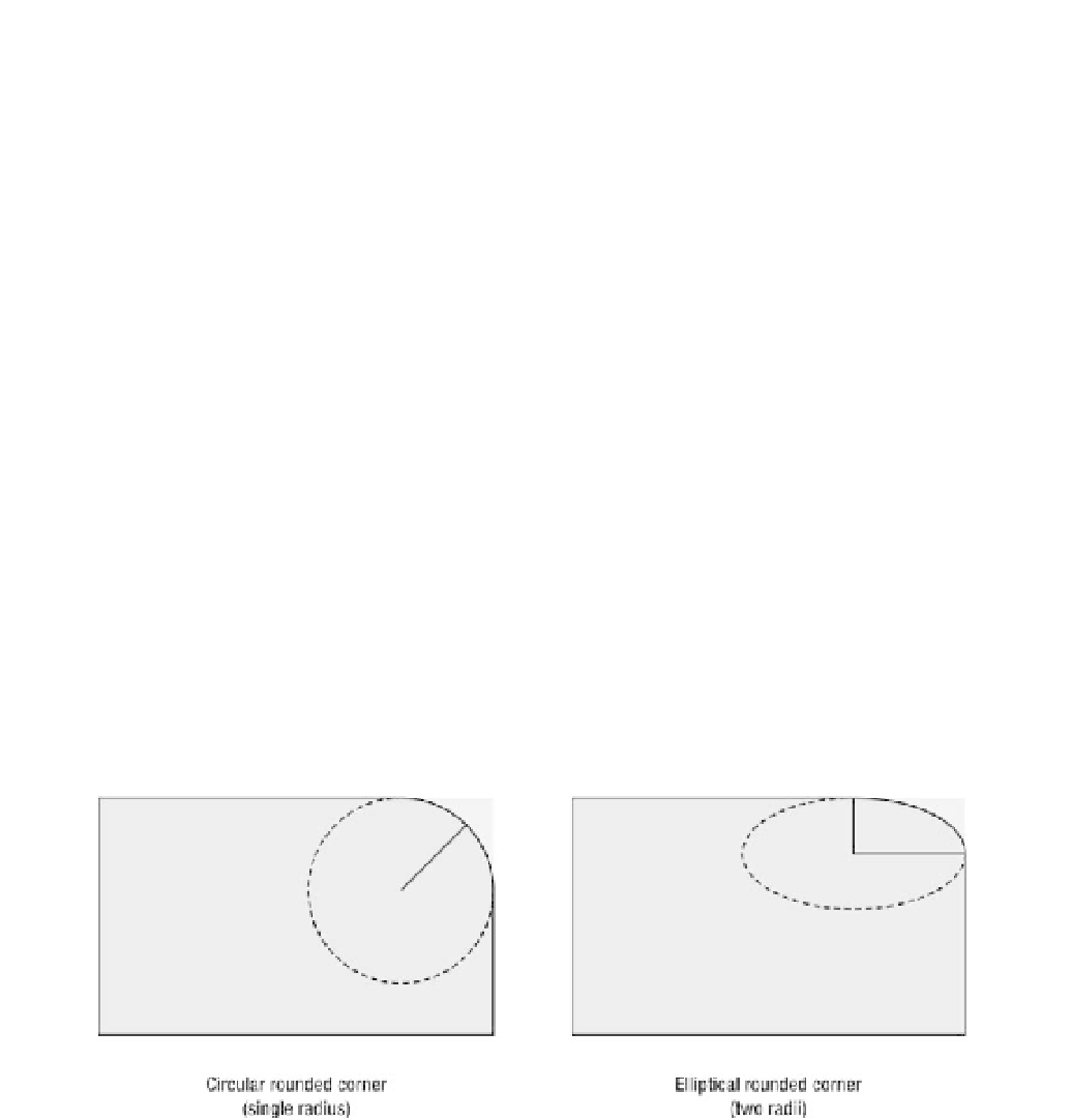
A longhand radius property with only one value draws an evenly rounded corner, defining the single radius
of a circle, like you see on the left in Figure 10-27. But a longhand radius property with
two
values
indicates an ellipse with two radii, shown on the right. The first value is the horizontal radius and the
second is the vertical radius:
.shoulder { border-top-right-radius:
10px 30px
; }
Figure 10-27.
A diagram of circular versus elliptical rounded corners
You can specify a radius with any unit of measure—pixels, ems, points, and so on—or a percentage, but
percentages do behave differently than fixed lengths. With a percentage radius, the browser calculates
each half of the corner's curve as a percentage of the parallel side's length. In other words, a single
percentage value will always draw an elliptical corner, especially noticeable if the box is rectangular rather
than perfectly square. Listing 10-29 sets up two boxes with rounded corners, one a perfect square and the
other an oblong rectangle.

