HTML and CSS Reference
In-Depth Information
Listing 10-28.
Revising the
.page-title
class to add
text-shadow
and a bottom border
.page-title {
font-size: 2.25em;
margin-bottom: .35em;
padding-bottom: .15em;
border-bottom: 1px solid #0cf;
text-shadow: 1px 2px 1px rgba(0,0,0,0.5);
}
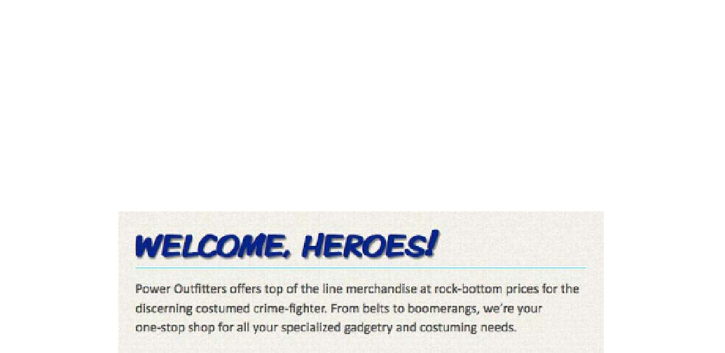
Figure 10-24.
The redecorated page title, now with a drop shadow
As you've seen, it's easy to create simple, realistic drop shadows, but you're certainly not limited to
simulating natural lighting. Clever application of the
text-shadow
property can also produce some really
impressive graphic effects, like you see in Figure 10-25. With no offset and a generous blur, a light-colored
shadow can appear as a luminescent glow against a dark background. Combined with RGBA colors,
multiple text shadows can produce overlapping, translucent duplicates. You can stack multiple shadows
and render a dramatic 3D effect by slightly adjusting the color and offset of each shadow in the stack.
Experiment with
text-shadow
and see what it can do. Just always remember that older browsers won't
render these shadows, so make sure your text will still be readable even without them.
Figure 10-25.
A few examples of
text-shadow
in action